Take a peek inside our design studio as we work on the brand identity development for our client, Tiny Bubbles. You’ll get the inside scoop on exactly where we start when working with a client on their brand (hint: it’s not where most designers start) and get a glimpse at the decision making process as we nail the design direction before digging into the brand’s logo and style guide.
But a word first- we’ve eliminated a staple in the design industry- the mood board.
Yes, we don’t do mood boards anymore. Instead we design three stylescapes and revolutionized the decision making process for our clients and eliminated uncertainty.
Why We Moved Away From One Mood Board in Our Brand Identity Development Process
Our clients used to come to us with their brand already envisioned in their minds.
They told us what they wanted, gave us some inspirational images, and we whipped up a quick moodboard to verify that’s what they wanted.
It took all of one hour, tops.
So why would we give up something so easy for a much lengthier, complicated process on our part?
Because those little mood boards weren’t worth anything to the brand identity development process. It’s what everyone else does, but as long as we had access to our client’s Pinterest, it was redundant. They already did the work. It was fluff work.
Mood boards also assume that all clients know exactly what they want coming into a project.
That’s all and great if our clients are creative beings- they know what they like and can just find a technical designer to give them exactly what they want.
And honestly, if you know exactly what you want and aren’t willing to budge on your creative vision, go hire someone on Fiverr and get a design technician to design your logo. They’ll do exactly what you tell them to.
But lately our clients don’t see themselves as that creative and they need guidance.
They need to see the possibilities that are out there for where their brand can go in the big picture.
And guess what? Even the most creative clients we work with are benefitting from this process, including our client Marcella, of Tiny Bubbles.
So now we develop three, highly curated stylescapes that include imagery, graphics, colors, textures, fonts, print design, anything and everything a small business could possibly need to see the possibilities of what their brand could become.
And that means we also include a user-profile in each stylescape- a person that represents who this brand is for.
These stylescapes are much more than just determining the mood- they become the map for the entire brand experience for the end user.
Important First Steps of Brand Identity Development: Attributes, Goals, and User Profiles
We also used to just send out a quick questionnaire to our clients to grab information.
We’ve swapped that for six, 2 to 2.5 hour virtual strategy sessions. You won’t get this at most brand identity studios.
Yes, we spend 12-15 hours strategizing with our clients in the brand identity development stage before we even design anything. And every second is worth it!
These sessions serve three purposes:
- Brand Therapy: Getting to the root of what you really want out of your brand- and sometimes life, we go deep!
- Brand Detective Work: Determining how exactly we’re going to pull off all your ideas
- Brand Matchmaking: Creating a plan for connecting you with your dream customers
Three important aspects of this intensive process (if you ever work with us you’ll need a nap after, or a drink- possibly both) go into the brand identity development:
- Brand Attributes: The feeling, aspirational identity, voice, culture, impact, and x-factor behind your brand
- Brand Goals: The top revenue, brand awareness, and efficiency goals for your business (ranked in order of importance)
- User-Profiles: All the dream clients of your brand, from the beginning user to the aspirational customer, each with a different story and set of needs that your brand can solve
Without these items, we can’t proceed in the brand identity development process in any meaningful way.
Tiny Bubbles: Our Client’s Creative Brief
Now let’s dig in to an actual client!
Tiny Bubbles’ purpose is to empower women to live life on their own terms, break free of society norms, and be confident in their own skin.
The goal is for the brand to become the first-mover in the vintage beach athleisure influencer space. Tangibly, Tiny Bubbles is an athleisure lifestyle blog where fashion is used as a tool to help stifled business women live a life of freedom, confidence, and fun.
The key brand attributes that affect the brand identity aesthetic are funky, nostalgic, and self-expressive.
As for the user-profiles, they all have a few things in common. They’re Gen-X, have disposable income, and have lost a sense of their identity. They’re either labelled mom, wife, boss, and feel stuck in their fashion and in life. In short, they need escape and fun! The Tiny Bubbles tribe of women embraces diversity, inclusivity, and understanding.
Marcella at Tiny Bubbles came to us with some very definite ideas about what she wanted her brand identity to look like but was open to possibilities.
Let’s take a look at how the process went down!
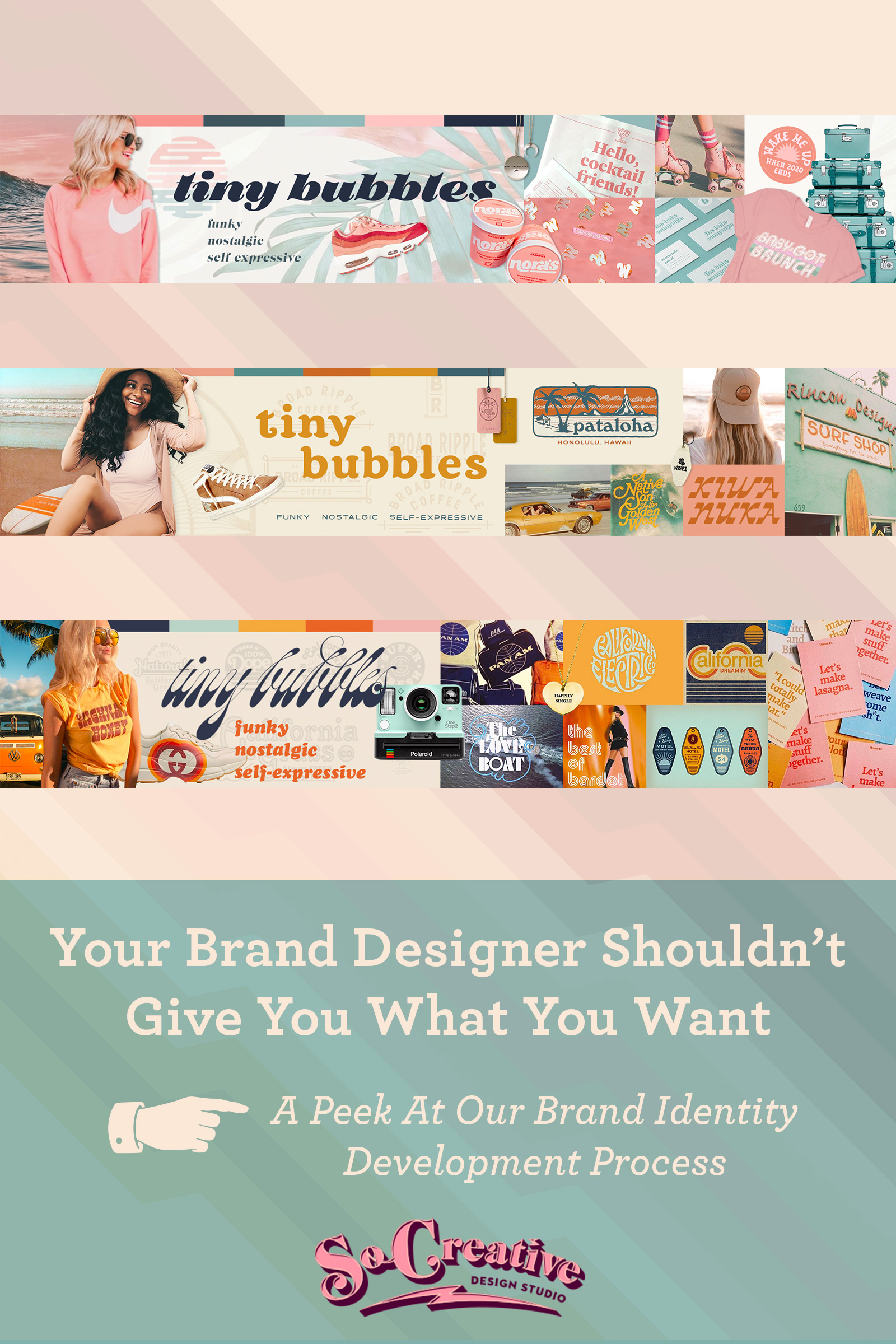
Stylescape #1: Sunset Chaser
This board checks off all the boxes of what our client originally came to us wanting.
It is light and beachy with plenty of sunset pinks and blues with just the right athleisure vibe.
It definitely says chilled and laid back- not taking life too seriously.
Now let’s see if it holds up to the brand identity development creative brief
Funky? A little bit. But on the funk meter, this one’s on the low end.
Nostalgic? A tad. It’s got some throwback vibes with the tee and the roller skates. But nostalgic images from Three’s Company or Bridgette Bardot on the beach that Marcella loves? Not so much.
Self-Expression? Yes, but it’s not screaming “be your own damn self.” Once again, this board is on the subtle end.
As for meeting our clients goals, it plays into athelsiure, but doesn’t scream “vintage beach.” We knew we wanted to gradually play up on the vintage vibes to see how far our client was wanting to go- once again, all about the possibilities! The look limits the brand to the beach and eliminates glamping and the mountains. Marcella’s vision includes Tiny Bubbles going on road trips and exploring.
But what about those user-profiles?
Our client is a blonde, white woman. So if she was her user-profile, then it would be a hell yeah. But her user-profiles are more diverse, having a broader demographic, including black women. Our biggest issue with this board as designers, even though we know it’s exactly what our client wants, was that it screams “white girl.” These are the sometimes uncomfortable conversations we have to have with clients- but we wouldn’t be doing our job if we lost sight of the user-profiles and just wanted to design in a style just for our client.
Board #1 Client Feedback
She loved this board! It’s exactly what she wanted.
She did admit that this board was very “white girl,” which was a concern.
But she was so excited! Not really loving the fonts (we learned she doesn’t like pointy fonts- good to know) but the vibe was 100% what she wanted.
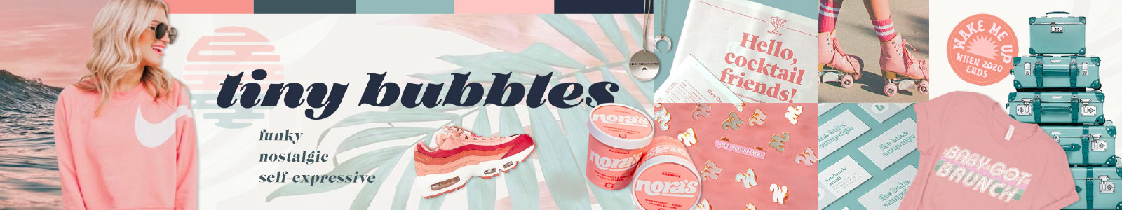
Stylescape #2: Surf and Sand
This board brings up the nostalgia, turns up the funk, and is a much more inclusive look- it doesn’t scream blonde girl with a Starbucks.
Our goal with this board was to show our client that with a bit of a sunshine color palette and faded out imagery, she’ll be able to accomplish more of the goals she’s aiming for.
This board says beach just as much as it says Palm Springs and road trips. It allows for more flexibility in location.
It’s also more funky and has a stronger vintage vibe, so her throwback images will make more sense here.
It still also says altheisure, but in a more sophisticated way. Her demographic is Gen-X, so while the first board says “young” this board says “youthful but mature” with some imagery that’s not so Millennial (that first board is very Millennial).
Brand Identity Development Surprises: Our Client Has an Aha Moment!
“I hate pink.”
Yes, the fog had disappeared and our client finally came to an epiphany that she needed to have before there was any brand identity design done.
She hates pink.
And she’s been posting pink on her IG and telling us she loves pink for weeks.
She loves coral.
She only needed to see the difference between the two, but just a couple minutes before she saw this board, she loved the last board in all it’s bubble gum glory.
For months she thought she knew exactly what she wanted and now she realized pink wasn’t what she wanted at all.
Just imagine the disservice we would have given her if we’d given her what she thought she wanted without going through brand identity development first?
She would have never been satisfied because there would have always been something off that she couldn’t quite put her finger on.
Board #2 Client Feedback
Marecella really appreciated the flexibility of this board in terms of location and the demographic it serves. She also loved that it was a bit more funky and nostalgic and that her throwback images from the 70s and 80s would feel more at home on her Instagram.
Once again- the fonts weren’t quite right (too much design at the end of the main font and we learned that she doesn’t like pointed fonts like the subhead- they need to be rounded at the ends).
And the yellow and rust were too saturated for her taste.
We were also able to finally put a name to the colors she was trying to go for. During this whole process Marcella had been calling her color choices pastel.
Like Easter?
It’s muted. She’s going for muted colors. Colors with a bit more gray in them.
Once again, if we had just designed what our clients said they wanted, she’d have a super pink pastel brand like the Easter Bunny’s vacation at the beach and it would have been all wrong.
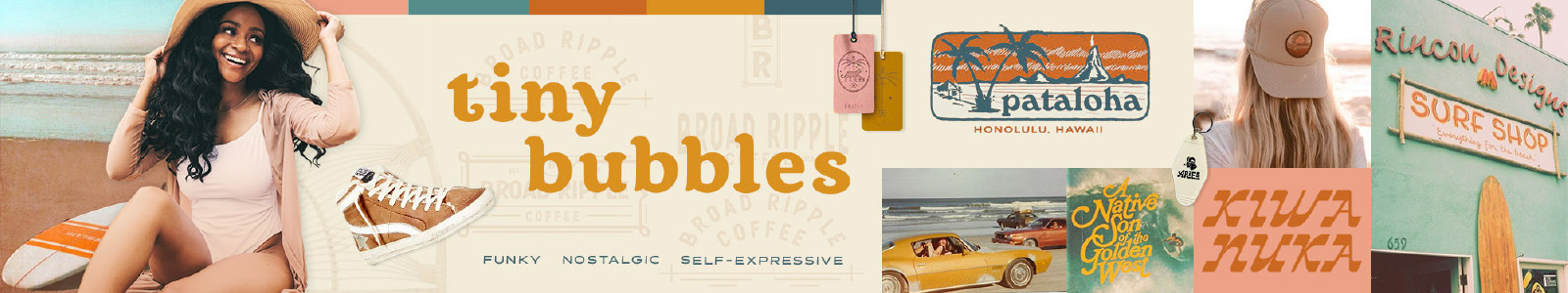
Stylescape #3: Shake Your Groove Thing
Who wants the funk?
This board was intended to push the limits of just how funky and nostalgic the Tiny Bubbles brand could be.
It had all the potential for throwback imagery. It’s at home on the beach and on a road trip through California.
And it has great inspiration for graphic tee design for the brand and reaches all of her use-profiles.
Board # 3 Client Feedback
Marcella loved it (of course she did!) but as for the overall look, maybe too funky.
She loved the potential for graphic tee design here, and the nostalgia was on overdrive.
But it does move farther away from athelisure and the beach.
As for the main font- too funky. But the subheading has possibilities (finally!)
And the colors are way too saturated to meet the realization that she wants a muted palette.
At this point, the first stylescape wasn’t anywhere near what she knew she needed. It was off the table.
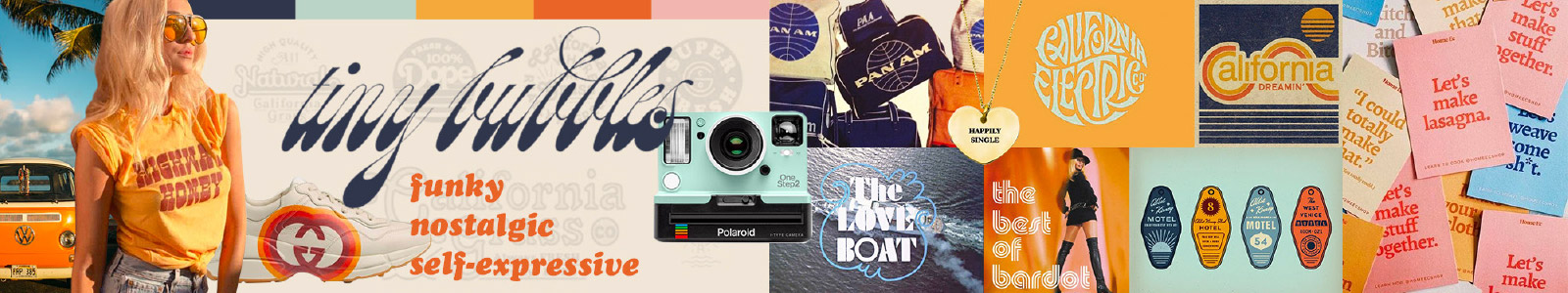
Requested Revisions for the Final Stylescape
Marcella ultimately chose the second stylescape as the base for revisions, but she wanted to incorporate a few things from the third stylescape, along with a couple of other tweaks. Here’s a list of her requests:
- Make coral a more dominant presences on the board
- Mute the yellow and rust
- Add in a lighter shade of teal
- Rework the fonts
- Change the user-profile to a woman that’s more funky
- Add the keychains, California Dreamin’, and Bardot images from the third board
- Add some kind of fitness/wellness imagery so she can envision it with the brand
The Final Stylescape: Sunset Cocktails
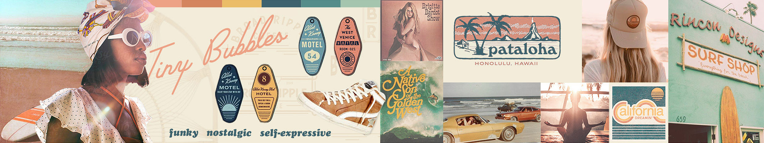
While our work is nowhere near done, we’ve finalized the brand identity concept!
And it’s not something we see everyday- which is huge in the lifestyle space.
It’s funky, and nostalgic, allows for self-expression and just screams let’s have a good time and not take life too seriously.
It meets the needs of both our client and her audience.
And while nothing has been designed or finalized, when we present the logo concepts, we all know they’ll be rooted in this aesthetic, and our client can also start working on getting her photography edited to meet the new look. Buh-bye pink!
Conclusion: Brand Identity Development Should Take Time
In the end, our client thought she knew what she wanted.
And if we had just given it to her without spending time to get clear on what she really needed, she wouldn’t have been happy and we’d have countless revisions and stress ahead of us.
Your brand identity is too important to your branding to spend a few days on it.
Your brand identity encompasses everything you and your customers need your brand to be.
Every touchpoint, every post, every interaction with your brand is a chance for your ideal customers to become immersed in your brand and the impact it can have on their life.
Brand identity development is much more than a quickie logo and a couple of colors. It’s about creating a world that your ideal customers, and you, love being a part of.
And if you want to become the leader in your space by doing things differently than everyone else and standing out, you better believe this process is going to take some time. It’ll be worth it!
And if you’re digging our process, we’d love to chat about working together on your brand! Book a call and let’s talk about the possibilities of your brand!