Designing Dixie- A Little Bit Whiskey, A Little Bit Rock ‘n Roll

Dixie Willard isn’t your typical interior designer. Maybe it’s the blue hair. Or the whiskey drinking. Or the fact that she hates picking out accessories. But her brand wasn’t saying anything about who she is, what she values, and who she serves. She came to us because there was a disconnect between the perception she was making and her true point of view. We set out to rebrand her company so it would appeal to the right clients while also staying true to Dixie’s own personality.

IT’S ALWAYS MORE FUN

TO SHARE WITH EVERYONE

Facebook
Twitter
LinkedIn

THE SCOPE

Brand Strategy

Brand Identity Design

Illustration

Marketing Collateral

Website Design

Website Copy

Dixie Willard Designing Dixie Portrait

Breaking Away From Tradition

Dixie Willard makes every decision for a reason. It’s no coincidence that she moved to Knoxville, Tennessee to set up her interior design business. The little research nut analyzed the data and knew the area was just asking for a designer like her to swoop in and help new residents get building. But what she didn’t plan was her brand- it just never felt right. She was tired of following the traditional interior design route- it was time to make some noise.

PROJECT GOALS

Shape the brand in a way that reflects both Dixie’s expertise and her clients’ lifestyle and needs

Pay homage to local culture through messaging and design

Create a rich, authentic experience for clients through thoughtful marketing materials

Create a cohesive online experience that logically combines the various income streams of the brand

The Identity System: Southern Comfort

Dixie isn’t like most interior designers. She’s much more interested in the heritage of her area and the needs of her clients than stroking her own design ego. Heck- she doesn’t even like to shop for furniture. We designed an identity system rooted in the aesthetic of the area and her architectural background that also shows off her whiskey-drinking, leather-jacketed, blue-haired personality.

Designing Dixie Dixie Willard Logo System
Designing Dixie Submark On Color System - White
Designing Dixie Submark On Color System - DixieBlue
Designing Dixie Submark On Color System - HoneyWhiskeyTint
Designing Dixie Submark On Color System - White
Designing Dixie Submark On Color System - HoneyWhiskeyTint

H1: Speakeasy Sans

Designing Dixie Brand Font System - H1

H2-H3, CTA's: Speakeasy Modern

Designing Dixie Brand Font System - H2-H3-CTAs

H4: Speakeasy Flare

Designing Dixie Brand Font System - H4

Body: Speakeasy Sans

Designing Dixie Brand Font System - Body Copy

The Brand Strategy: Getting to Know Knoxville

During strategy sessions, the Gold Sheep team worked with Dixie to develop her brand story- who she is, who her customers are, and how they work together in her brand ecosystem.

Designing Dixie Brand Strategy Guide

This Ain’t No Stock Brand

Dixie was all in with her new messaging, brand values, and design aesthetic, so she had us design custom illustrations to highlight her brand’s purpose. Because when you’re known for having a rock ‘n roll style, you can’t go half-ass with stock icons.

Solid Gold Networking

The biggest part of Dixie’s marketing strategy is building personal relationships. But given that she’s introverted and would rather sit in a corner than mingle at a chamber meeting, we wanted to design her something that would make her stand out. We went for a foldable, gold foil business card that does the talking for her. Combine that with client thank you cards and envelopes, and her reputation in the community is gold!

Designing Dixie Branding Materials

Focusing on the Fans

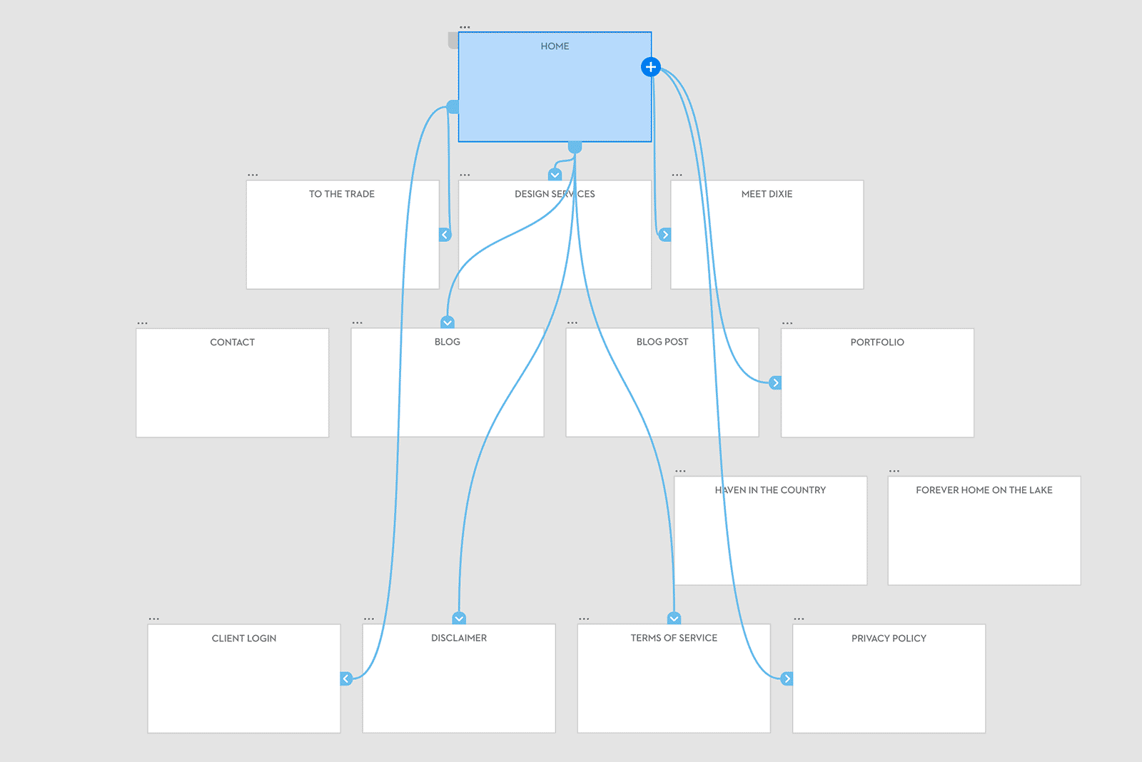
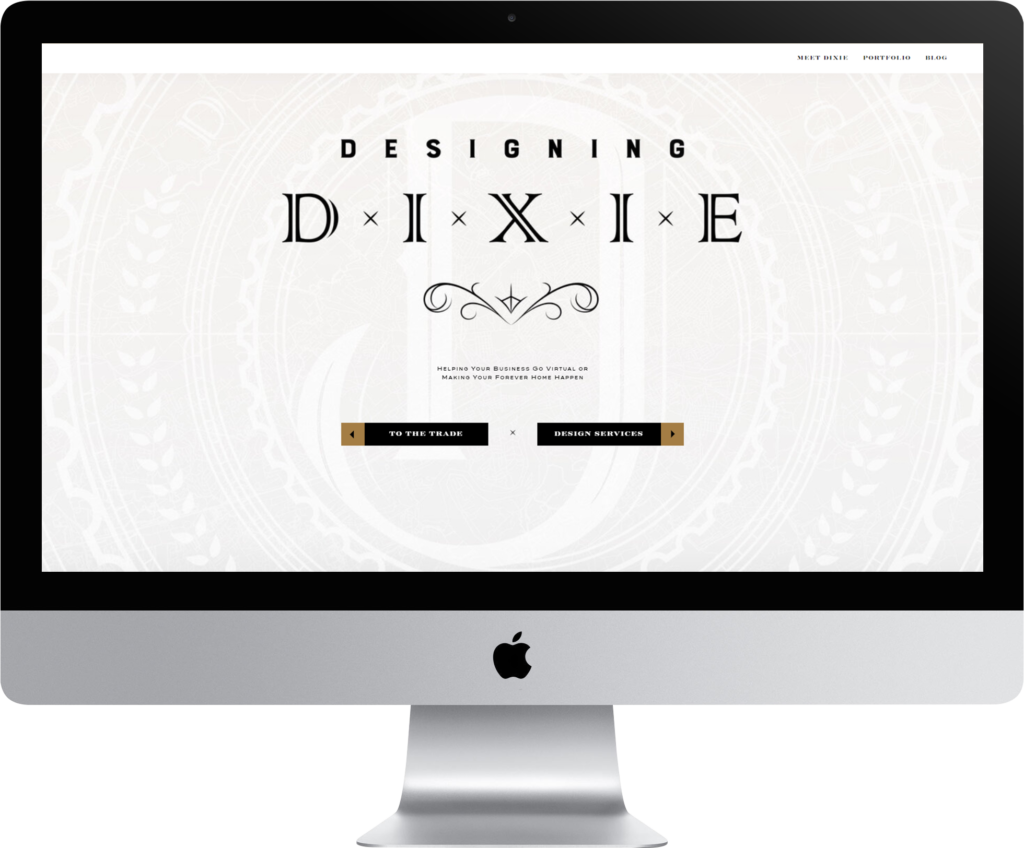
After establishing her new brand and identity, Dixie had an enviable problem. She was getting noticed. Other designers flocked to get help turning their businesses into virtual machines. This called for a completely new website strategy, one that combined the needs of her design clients and also served the designers she mentors.

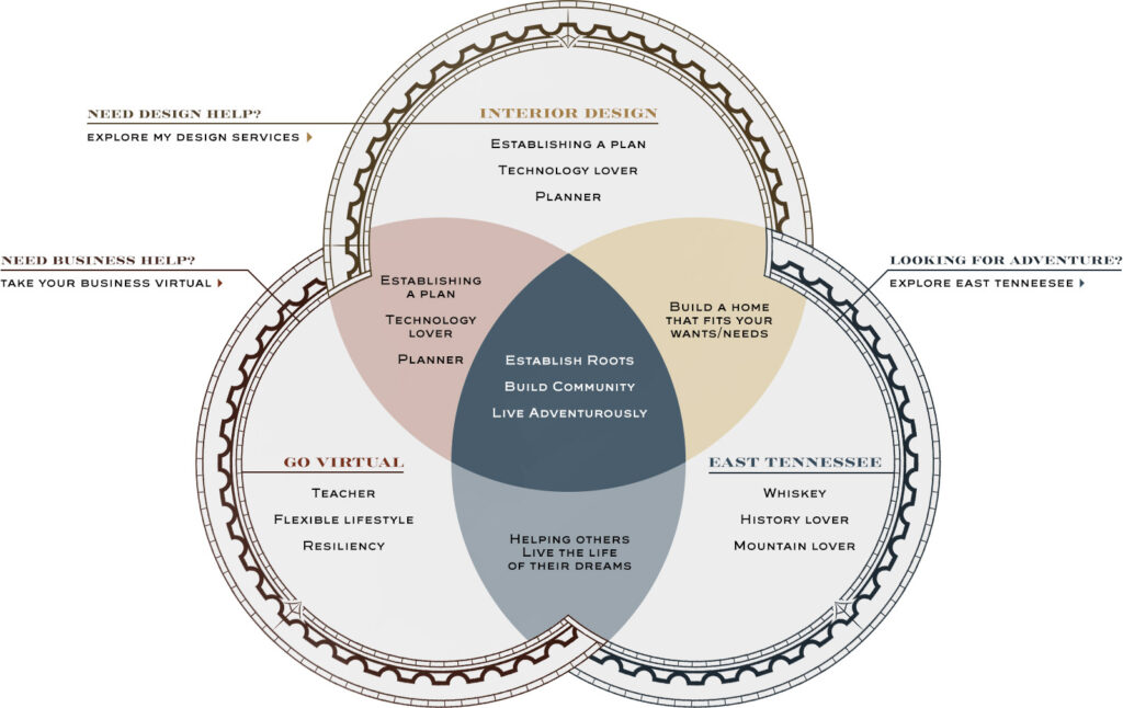
Dixie does a lot, so rather than go on and on about all she does in boring copy that nobody will read, we designed a diagram for her About Page that not only clarified what she does, but sent people in the right direction on her site.

Designing Dixie Website Design Architecture Adobe XD Map
Designing Dixie Brand Venn Diagram
Designing Dixie Website Design

No More Template Tears

When we asked Dixie her checklist for the new site she said, “I don’t care how it looks as long as it doesn’t look anything like any other interior design website.” Mission accomplished- we designed a new site for her on Showit, giving us the design freedom to break away from a cookie-cutter template, along with custom patterns and copywriting that gave her a website as unique as the homes she builds.

“I work in an industry where cookie cutter branding and messaging are the norm. The problem? I’m not a cookie cutter designer. The Gold Sheep Design team understood that I needed something different. Something that reflected my unique personality and pulled in my ideal clients. Stephanie and Nathan did an amazing job! I can’t tell you how many times I’ve heard “I’ve looked at other designers’ websites and none of them spoke to me like yours did” from my clients. That’s music to my ears!


The down side, of course, is that thanks to Stephanie and Nathan, I’m booked out for the next year. Wait…that’s not really a down side, is it?”

Dixie Willard – Owner

READY TO JAM WITH US?

Gold Sheep Design Logo | Stay Gold

Design is Our Business.
Pop Culture is Our Happy Place.

Gold Sheep is a creative studio based in Southern California specializing in brand design, digital illustration, and custom letterforms that tell stories, grow fandoms, and celebrate music, mystery, and the magic of pop culture.