Gold Sheep Design: Burning Down the House

What do you do when you wake up one morning and realize just how utterly unhappy you are in your business? Especially when business is great? Well, when brand-building is your business, you finally give your own brand the attention you give your clients. And for us, that meant a new name, new positioning, burning down everything so we can serve industries and clients that bring us joy and make an impact on our lives- musicians and pop-culture enthusiasts.

IT’S ALWAYS MORE FUN

TO SHARE WITH EVERYONE

Facebook
Twitter
LinkedIn

THE SCOPE

Brand Strategy

Brand Identity Design

Illustration

Custom Stock Photography

Website Design

Website Copy

Content Creation

Dig Down: The Positioning

It started with the simplest step- we made a list of the ten brands we’d love to work with. It was no surprise when we noticed over half were music related- Muse, Khruangbin, Fender, Manson Guitarworks, Jack White- since we play music (badly) in our off time- and all our dream clients are in the entertainment world. And then it all became clear- music and entertainment  are such a big part of our lives outside of our business, why couldn’t serving musicians be our business? 

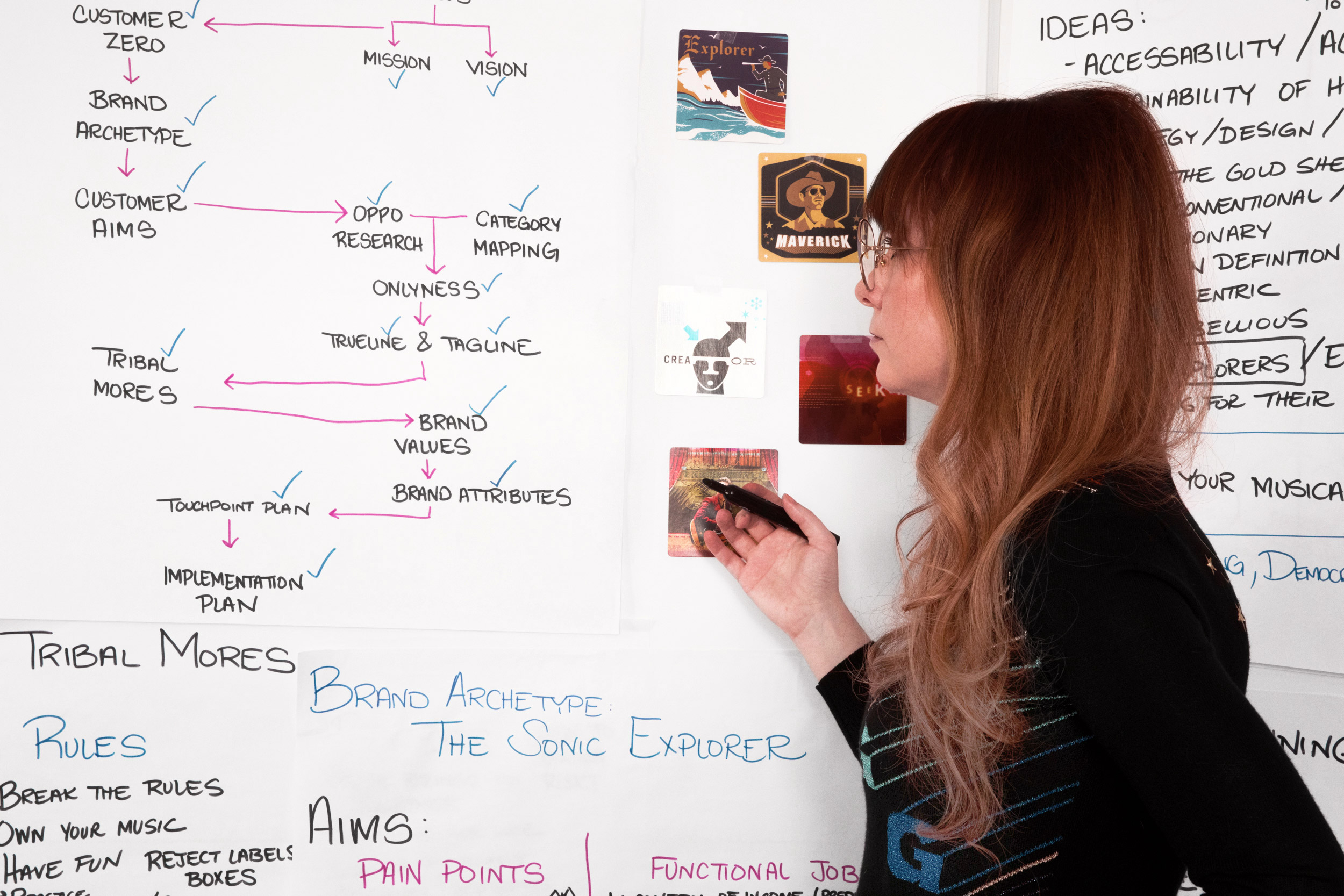
Through several strategy jam sessions (and some fine bottles of wine) we came up with the foundation for our new brand: our purpose, our competitive advantage, our values, and the needs of our client archetype: The Creative Explorer- nonconformist personal brands and companies who are on a never-ending journey to experiment, collaborate, and bring people together outside the realm of the rules of society.

Positioning

Gold Sheep designs brands that amplify the frequency of music makers to eleven.

Tagline

Stay Gold

Client Archetype

The Sonic Explorer

Positioning

Gold Sheep creates custom designs for music and pop-culture brands that tell stories and grow fandoms. 

Tagline

Stay Gold

Client Archetype

The Creative Explorer

PROJECT GOALS

Develop positioning that aligns our business with our passion and values

Align our visual identity and messaging to reflect the various facets of our personalities and that of our clients

Put more fun into our business and enjoy every step of the process

Encourage others to take bold branding moves by doing so ourselves

His & Hers Stylescapes

We wanted to make sure that we were both happy with the direction of our new visual identity, and that it would also be appealing to our ideal clients, so we set out to create separate stylescapes. The plan was to bring them together into one master vision for the brand, but hey! They were actually really close in vibe so we moved forward with both. Steph had to have some serious convincing on the red, but she’s a big girl and knew it was the best decision for the brand.

HIS STYLESCAPE

Gold Sheep Design Music Branding Stylescape - His

HER STYLESCAPE

Gold Sheep Design Music Branding Stylescape - Hers

Not Just a Name, an Identity

We loved our old visual identity- but there was one huge problem. What we thought was going to come off as David Bowie meets Wes Anderson for eccentric creative types was primarily attracting people for one reason- the pink. The pink killed it! We were getting a whole lotta love- from the wrong crowd for us. And while love don’t pay our bills, we do want to love the work we do. The visual identity had to go. And so did the name.


Our old name was super pragmatic- it was one of the founders initials and it ranked really well in search engines. But it was boring and didn’t capture the essence of who we are- who our clients are. Gold Sheep was always a title Stephanie, one of our founders, used for herself. Not the white sheep of the family (too much of a free thinker) and not the black sheep (she’s never done anything that scandalous). Eccentric, unconventional, not settling for what society expects- that’s a Gold Sheep.

Gold Sheep Design Brand Logo System
Gold Sheep Design Brand Submark - White
Gold Sheep Design Brand Submark - Black
Gold Sheep Design Brand Submark - White

H1-H4: Microgramma Bold Extended

CTA's, Body: Neutraface

Gold Sheep...

Make their own rules

Reject labels

Break convention

Take risks

Behold, The Sonic Explorer Online Experience

We hate stock content- it gives us the hives. And when you’re trying to capture the identity of a tribe of people that society often forgets, good luck finding the perfect photo or graphic in a stock library. Custom illustrations, photography, and patterns bring the Creative Explorer to life in all our digital touchpoints, from the website to Instagram.

Gold Sheep Design Jazzmaster Guitar IIllustration Full

Custom Digital Crosshatch Guitar Illustration

Gold Sheep Design Jazzmaster Guitar IIllustration - Zoom 1

Guitar Illustration – Detail 1

Gold Sheep Design Jazzmaster Guitar IIllustration - Zoom 2

Guitar Illustration – Detail 2

INSTAGRAM CAROUSEL DESIGN & BRAND PHOTOGRAPHY

Gold Sheep Design Instagram Carousel Design
Gold Sheep Design Brand Website Design

WEBSITE DESIGN

The ultimate goal of our rebrand was to not just have a home that feels more like us. It was to have more fun in our business while serving a community that we care about. Helping bands and brands off the beaten path make a living doing what they love and to raise the voices of those society often overlooks- that was the ultimate goal.

READY TO JAM WITH US?

Gold Sheep Design Logo | Stay Gold

Design is Our Business.
Pop Culture is Our Happy Place.

Gold Sheep is a creative studio based in Southern California specializing in brand design, digital illustration, and custom letterforms that tell stories, grow fandoms, and celebrate music, mystery, and the magic of pop culture.