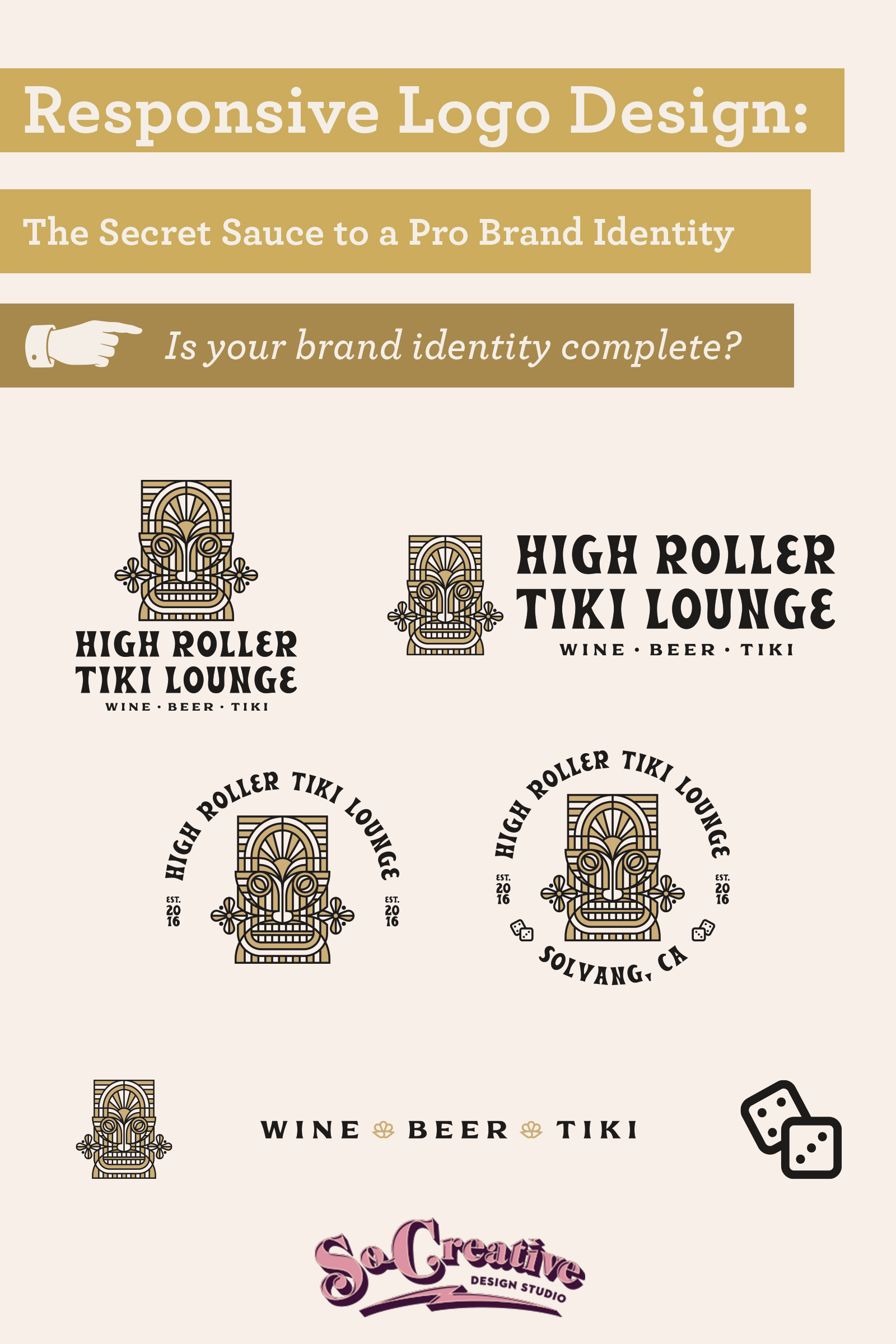
Ever been on Pinterest and Instagram and see all these different logo variations? Why do you need so many logo types? Do you need even need so many logo types? And what about brands that have logos that are all different in design- why do they do that? It’s all about responsive logo design- having the logo you’ll need for all the places you park your business.
Let’s demystify which types of logos you’ll need for that pro brand identity you’re looking for.
What is Responsive Logo Design?
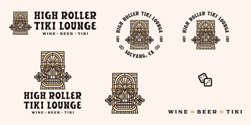
Heard of responsive web design? It’s that magical moment when your website switches proportions and design when it moves from device to device. Your website is going to look different from desktop to tablet to mobile.
Your logo should be responsive as well- meaning it changes orientation depending on it’s use in your brand.
You’re not going to put a horizontal logo inside your Instagram avatar. It won’t fit and you’ll look sloppy.
Responsive logo design ultimately is having a logo layout (we call them lock-ups) that will fit wherever it is needed while still maintaining the cohesiveness of your brand identity.
Responsive Logo Design vs Fluid Logo Design
Responsive logo designs means you have several variations but they’re all rooted in the same design. They have various lock-up variations but all work together without confusion.
Fluid logo design has various lock-up variations and not all of the logos are rooted in the same wordmark (your brand’s name written out in words) and logomark (symbolic icon).
Fluid logo designs can be a lot of fun- but clarity is thrown out the door because from one design to another, there is no brand cohesion. Unless you’re already a huge brand, you won’t be recognizable.
We do not recommend fluid logo designs- they’re too haphazard.
So when does fluid logo design come in handy?
Clothing companies.
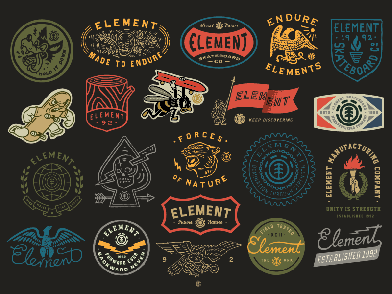
If you sell graphic tees, you’re going to want as much variety as possible.
That’s why brands like Element Skateboards and Patagonia, who have some pretty great fluid designs, can get away with this approach.
They have their main responsive logo design, and then they play. It makes sense for their industry.
They also have well-established brand identities.
Unless you need a wide variety for various merchandise opportunities, you do not need a fluid brand identity. You need a responsive logo design system.
What are your various options? Let’s dig in.
The Horizontal Logo Lock-Up
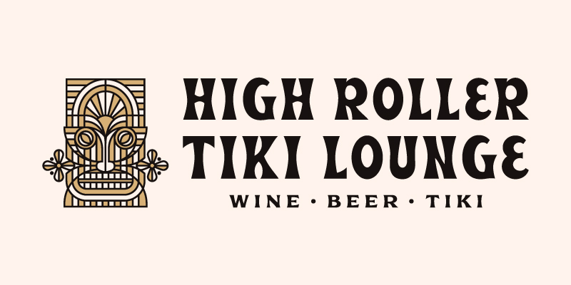
If you’re doing business from a website, you’re going to need a horizontal logo to put in your navigation.
This logo orientation also works well for signage above a storefront.
The Stacked or Vertical Logo Lock-Up
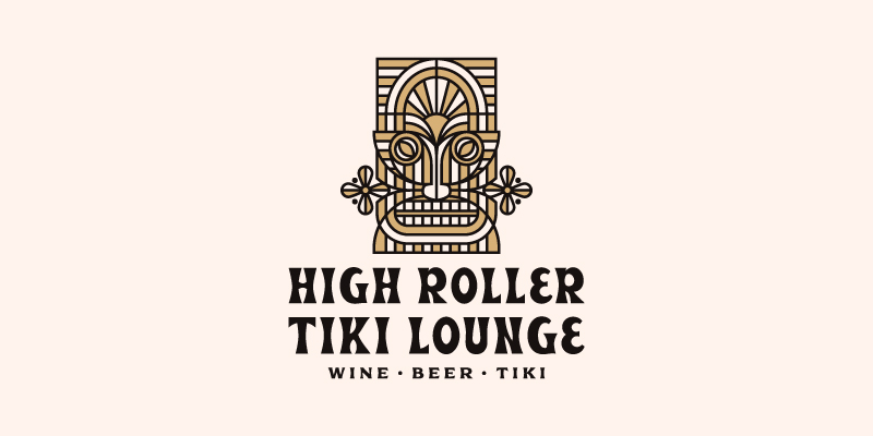
Stacked logos take up vertical space, so use this in spots where you have more vertical space (as in NOT the top of your website).
Stacked logos look great on business cards, on shirts and mugs, and in the footer of your website.
The Social Media Avatar
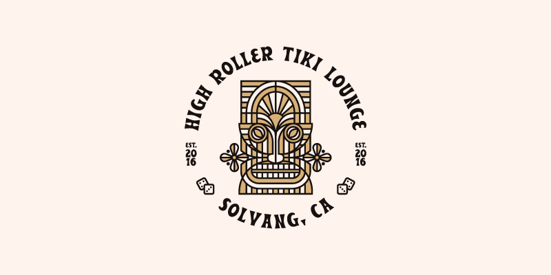
Think about your social media.
The avatar is normally circular, so have a logo that works within that circle.
Having your logo cut off in your social media avatar is sloppy- don’t be sloppy.
The Standalone Logomark
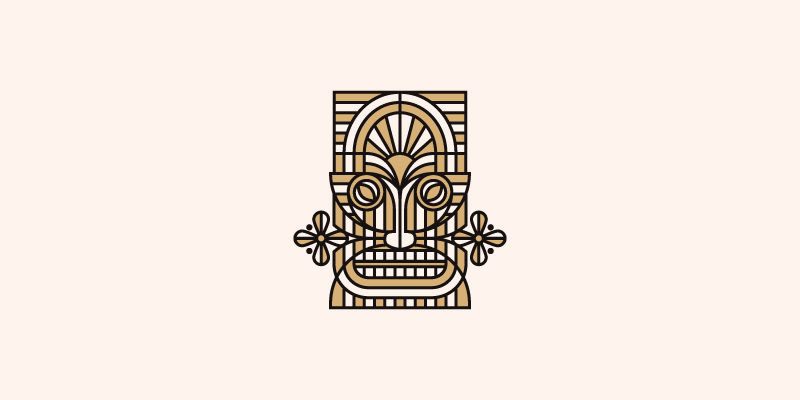
Now not all logos will have a standalone logomark- as in an icon that goes with a lettermark (basically words only- like ours).
And if you don’t have a logomark (think symbol) you’ll be more limited in your responsive logo design system.
But if your logo is composed of a logomark and a lettermark, make sure to get the logomark by itself.
This is great for merchandise, packaging, and pattern design.
The Favicon
The favicon is that tiny little icon that goes next to your URL in the address bar of an internet browser. Think of the most simple design that goes with your logo set for the favicon.
Additional Lock-ups for a Responsive Logo Design Set
The Badge and Seal
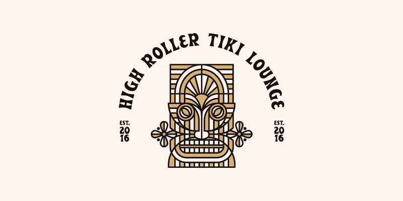
If you’re going to be heavy in merchandise design or print design, badges and seals are a great way to diversify your icon set while keeping the brand cohesive.
Seals also look great in wax seals for envelopes and embossed into business cards. We’ve had several clients use their seals for that purpose and they look sharp!
The Tagline Mark
If you have a tagline or several brand phrases you want to plaster all over your designs, get a tagline mark created to go with your icon set.
This is a great way to add variety without going the flexible design route.
Remember, until you reach the point where you’re needing to put your brand out there on merchandise and want variety season after season, stay away from flexible logos and stick with responsive logo design.
Why Do We Have a Limited Responsive Logo Design?
So Creative Design Studio is a pretty simple brand when it comes to our own brand identity because we don’t need a great variety of lock-ups.
We have a website and a couple of well-planned social media outlets.
We don’t have much in terms of print design and we don’t sell merchandise with our logo.
So we need a simple logo set.
The more places you’re going to be and formats you’re going to play around with, the more logo lock-ups you’ll need.
How Do You Determine Which Designs You’ll Need in Your Responsive Logo Set?
No brand is the same, so not every brand will need the same lock-ups.
We designed a very elaborate logo lock-up for a client once because we there were plans to put it on the side of a building.
We would never use that logo lock-up on a business card.
The best way to know which logos you’ll end up needing is by going through in-depth brand strategy before any logo set is designed.
So if you see logo designers not offering responsive logo designs and include a set of designs they’ve determined beforehand- run for the hills. They’re not doing their due diligence and discovering all of the use cases your brand will need.


