Part five of the StoryBrand Framework is crafting an effective call to action.
Every great guide calls their heroes to action so they can win the day.
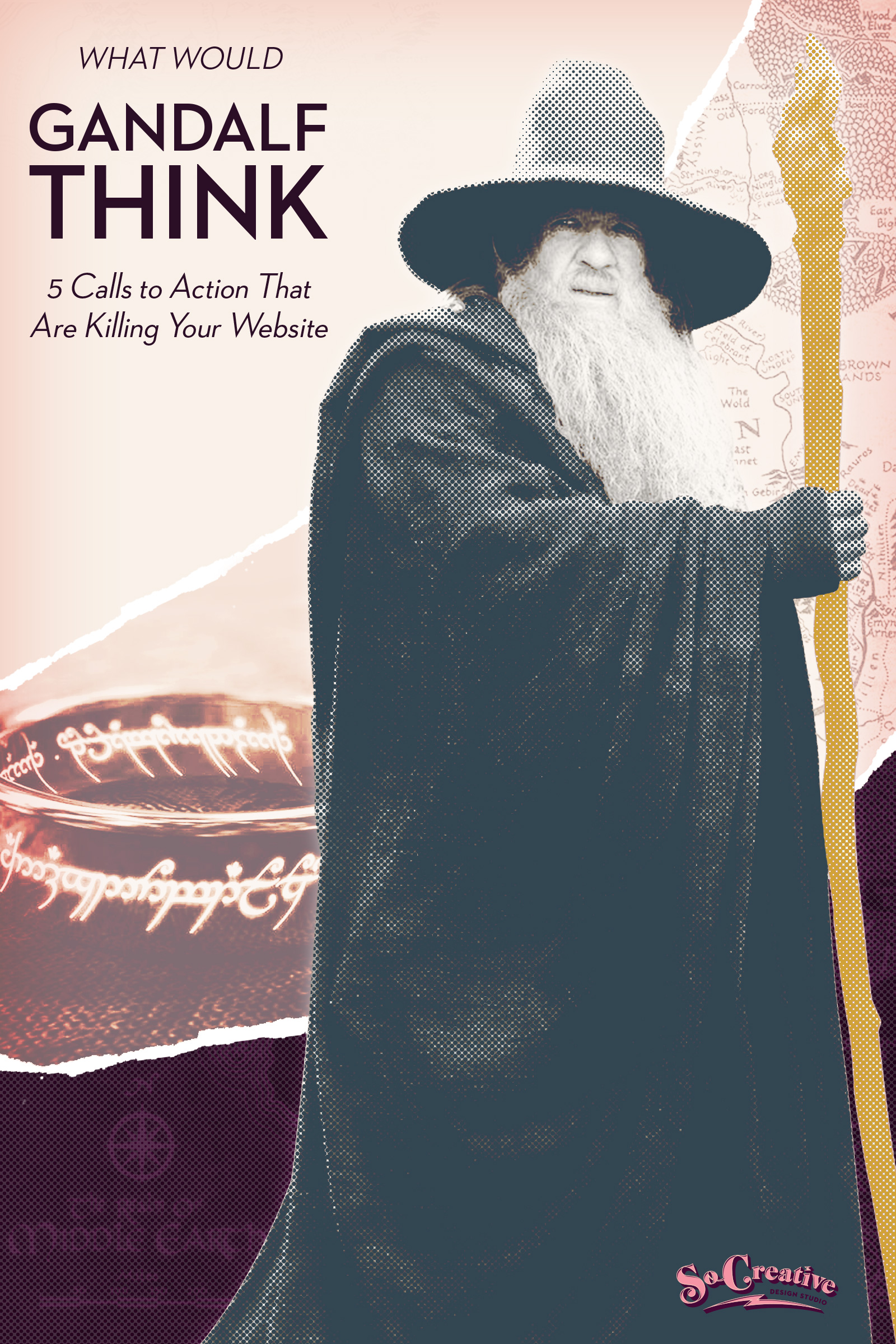
And Gandalf was a great guide. In The Lord of the Rings, he told Frodo exactly what to do.
He tells him to get the ring to Bree. And to eventually destroy the ring.
Great guides tell their heroes exactly where to go and what to do.
They know how to craft a strong, direct call to action.
People go where you tell them to go. That’s why writing an effective call to action on your website is crucial for converting visitors into leads and clients.
Here’s five not-so-strong calls to action that Gandalf would never use, and neither should you.
Weak Call to Action #1: Contact
This is not technically a call to action, but it’s the closest thing you’ll find on most websites, particularly service-based ones.
Becoming a hero can be scary, depending on your service or product.
If Gandalf told Frodo to just contact him, Frodo would be like, “Are you crazy, old man? This mission is dangerous!”
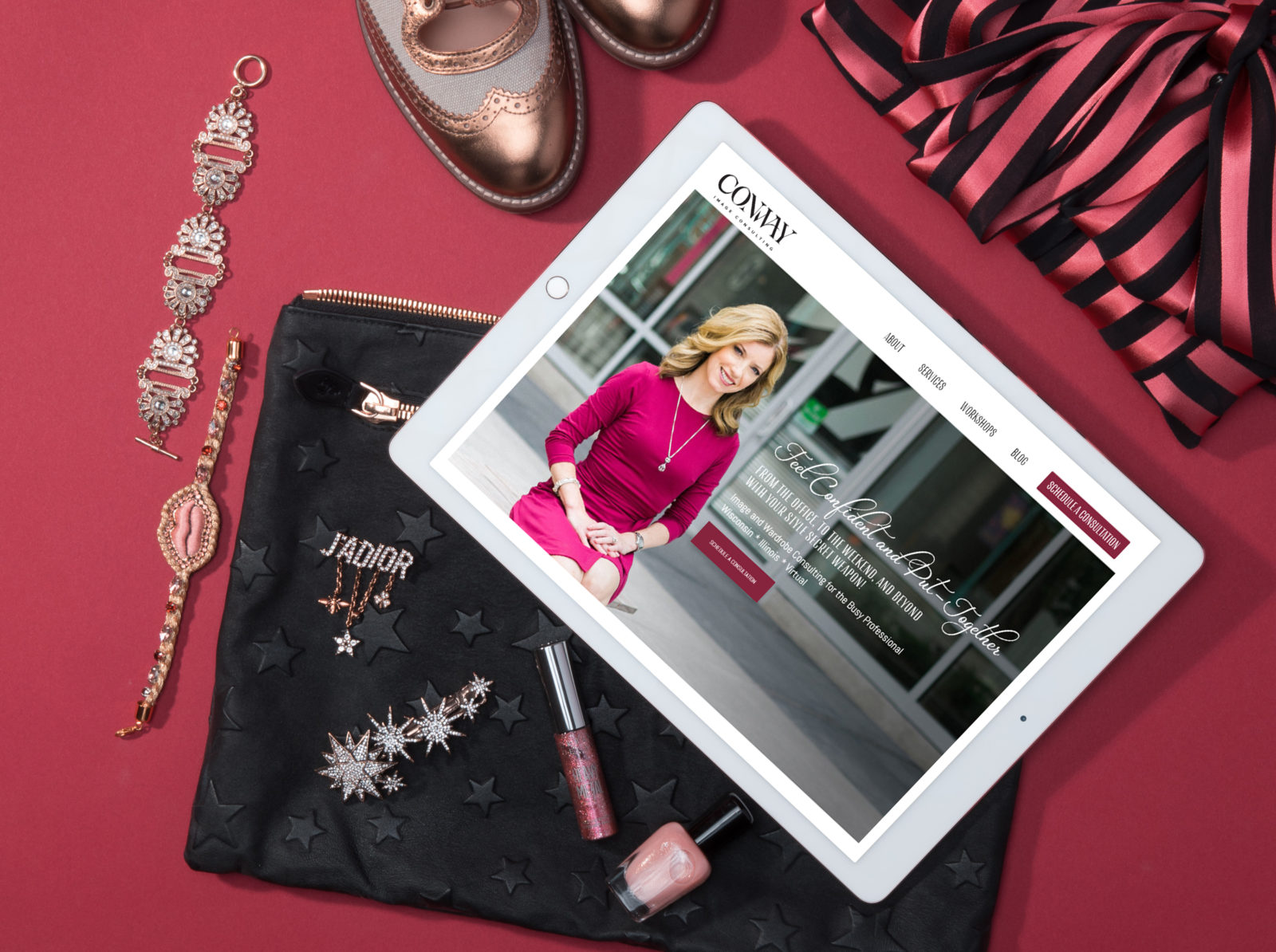
One of our clients, LeAnn Conway, offers image consulting, which is scary. It takes a lot for people to admit that they need help with their appearance. There’s a lot of self-shaming going on. Her clients need something a lot more enticing than “contact.”
Why This is Killing Conversions
Why are people contacting you?
To schedule a consultation?
To book an appointment?
Contact is too vague and it’s not calling people toward that first step of working with you.
How to Rework “Contact“
Put the first step in working with you!
Use active verbs like “schedule,” “book,” “request,” or “get” and then add whatever it is they’re requesting, such as a call, a consultation, an appointment, or a quote.
Rethink Your Contact Form
Most websites have a contact form, but why do you want people to contact you?
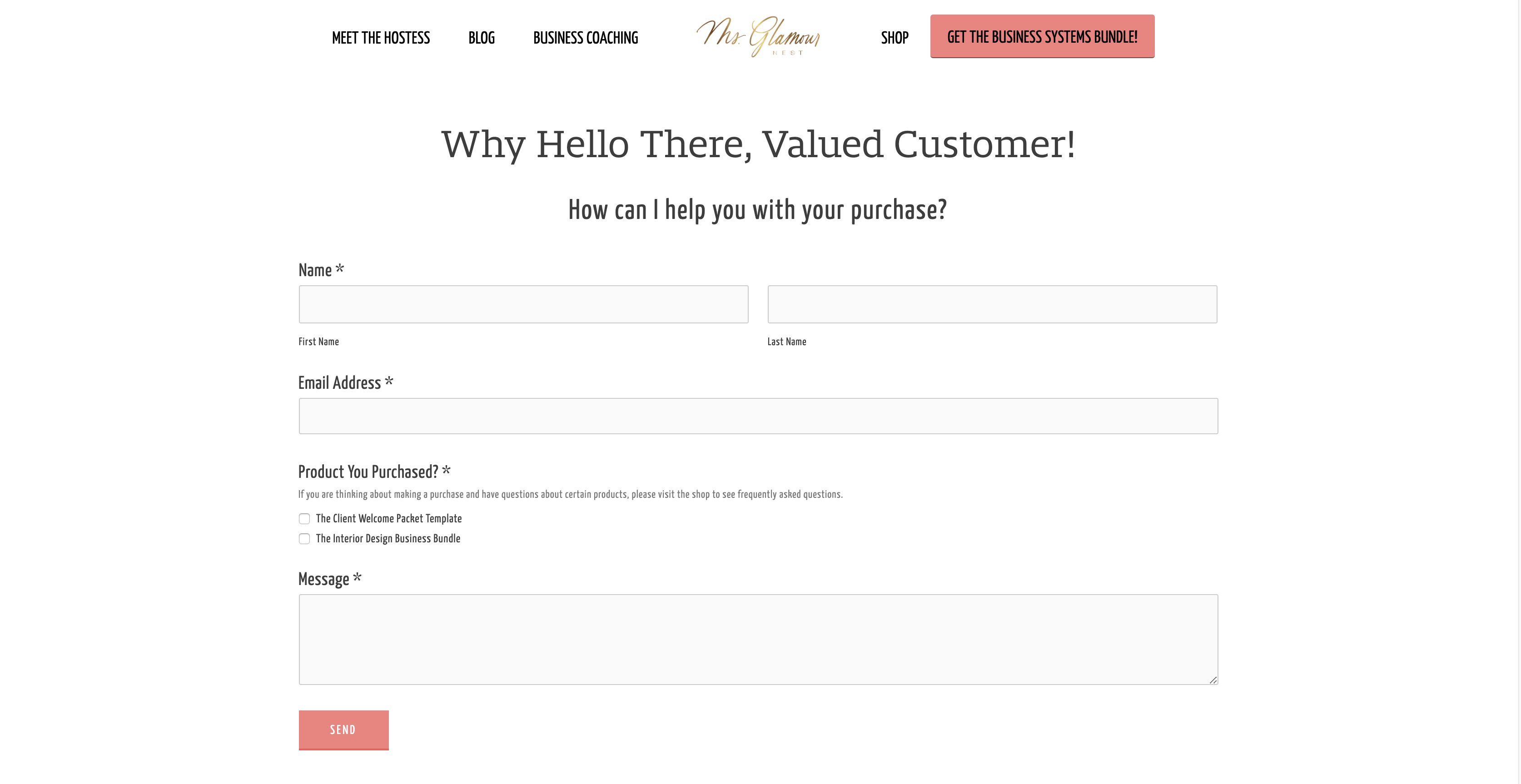
If they’re scheduling an appointment or call of some kind, use your contact form as a client intake form.
If they’re requesting a quote, then use it as a project intake form.
If your contact form is for customer service only, label it “Customer Service” and put it in your footer instead of your main navigation.
We did this with one of our clients who sells digital products.
The only reason people need to contact her is for customer service, and we also made it clear on the contact form that it is to be used for questions from customers and that all products have an FAQ section so she doesn’t get a load of emails that are unnecessary.
Yes- you will be breaking an established rule of website design by not having a traditional contact page. But I always liked rule-breakers the best!
So while all your competition is wasting time responding to random questions and juggling the spam that comes with a generic contact page, you’ll be responding to client inquiries instead!
Weak Call to Action #2: Read/Learn More
I know you see this everywhere so you’ve thought it’s the norm.
And it is.
But that doesn’t mean it is the most effective call to action.
If Frodo read more about this whole ring situation, do you really think he’d have moved forward?
And while your clients aren’t risking their lives in a fantasy movie, if they’re on your website, they want their problem solved. They don’t want to read or learn.
Why is This Killing Conversions
Learning or reading more isn’t solving anyone’s problems.
Each page on your website should have one clear, direct call to action that leads to a sale.
And it needs to be repeated over and over again because people will go where you tell them to go.
I was recently at Disneyland and was stuck in the parade detour lane.
I was directly told to go there by some very nice cast members.
They didn’t ask if I wanted to “learn more” about what to do during the parade.
Can you imagine?
So while read/learn more has its place on your website, your direct call to action, the one where you’re telling people where you really want them to go, needs to dominate.
And these types of passive calls to action should never be in your navigation or the first banner of your site.
Lead people to where you want them to go.
When to Use Learn/Read More
Some sites don’t need this at all!
But there could be some places where they come in handy.
When we design sites for our clients, we typically have a section that explains the business in a nutshell called the one-liner.
From there we have a “Read More” button for people that are interested in reading more about the company to see if it’s a good fit for them.
And often times we’ll have clients that want to lead people to the best possible service possible, so we provide three or four paths for visitors to choose from.
I like to call this the “choose-your-own-adventure” section.
Learn more could work there, buy you could add more detail such as, “Learn more about the course,” “Learn more about our services,” etc.
Weak Call to Action #3: Get Started
I was at StoryBrand certification and the idea of “get started” was brought up.
We started talking about how your website is like dating.
People get to your site and see some things they like but they aren’t quite sure they want to “marry” you yet.
So imagine that you’re at a bar, or wherever the heck people meet these days- I met my husband when I was 19 in a Photoshop class of all places.
You see someone that you like.
They see you checking them out and casually walk over and whisper in your ear, “Get Started?”
Can you imagine? Reminds me of Night at the Roxbury!

And if Gandalf told Frodo to get started, how the heck is he supposed to know what to do and what he’s starting?
I know it’s not that bad on a site, but you can do so much better!
What are they “getting started” with?
Make that call to action active!
Download the Free Guide
Get Access to the Membership
Enroll in the Workshop
If nothing else, rephrase your call to action into “Start a Project” or “Get Your Design Started.”
Weak Call to Action #4: Why Us
Not as common, but common enough that it needs to be addressed.
Why This is Killing Conversions
“Why Us” is often seen in navigations and I’m sure it leads to some page where the business talks about how fabulous they are.
I wouldn’t really know.
I never click on those links.
Gandalf never asked Frodo if he wanted to know “Why Gandalf.” Pointless.
And why would you waste valuable real estate on a link in your main navigation on something that isn’t getting clicks.
And if you have this and want to prove me wrong, please go look into your Google Analytics and see if you are getting clicks.
Better yet… check to see if once people land on this page they’re converting.
What to Say Instead
First, you don’t need a page all about how great you are.
If you prescribe to the idea that your business is the guide that’s going to help clients and customers to success, then bragging about yourself on a whole page is out.
So how do you talk about yourself in a way that isn’t braggy?
Through showing empathy and showing authority.
What to know more about how to do this? Then visit this related blog post.
Weak Call to Action #5: Let’s Do This
Okay, I get it.
You’re being creative.
You’re fun and you want people to know it.
Why This is Killing Conversions
“Let’s Do This” is a jazzed up version of “Get Started.”
What are you going to do?
I won’t bore you with more ideas. Go back to the “Get Started” section and rewrite any vague call to action that you have that involves just doing it.
The words you use on your website matter.
They’re how you let people know how to work with you or how to make a purchase.
Go through your website copy and change any weak or non-existent calls to action into powerful, active ones that drive sales. And always think, would this be something a guide would say to get their clients on the road to becoming a hero?
What will you be changing? Let us know in the comments!
Next Up:
StoryBrand Framework Part 6: Success and How to Give Your Website Visitors a Captain Marvel Moment