5 Reasons Why We Moved Our Website to Showit and Why You Might Want to, Too!

Showit website designs are the answer! Entrepreneurs often suffer from analysis paralysis when it comes to choosing the perfect website platform for their business. We’ve used a variety over the years and can say that we are finally thrilled to have moved to Showit.
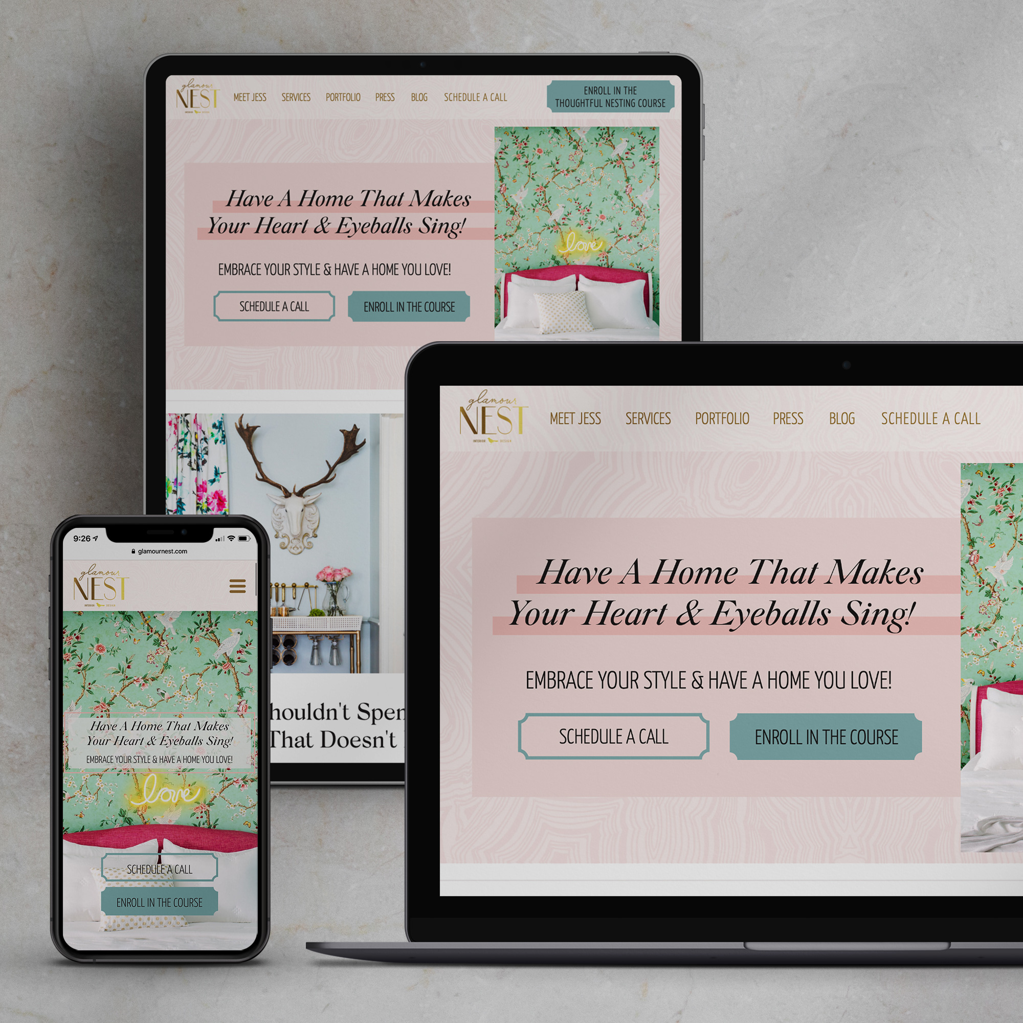
We were first introduced to Showit website design when we built a new, fully customized website for our friend Jessica McClendon at Glamour Nest.

Since we had already decided to create a completely new brand and website from scratch, we immediately made plans to make the move from Squarespace.
Having had experience with WordPress, Squarespace, and Showit, we know that each have their pros and cons, but if you are looking for an easy-to-edit, fully customizable site without the pain and anguish of coding, you’re going to love Showit.
1. Showit Website Design Allows for Mobile-First Customization

In case you didn’t haven’t read the 200+ ranking considerations under the Google algorithm like I have, Google is now indexing sites based on mobile-first design. Meaning they are paying more attention in the rankings to how your site is designed for mobile.
Because more and more people are using mobile over desktops.
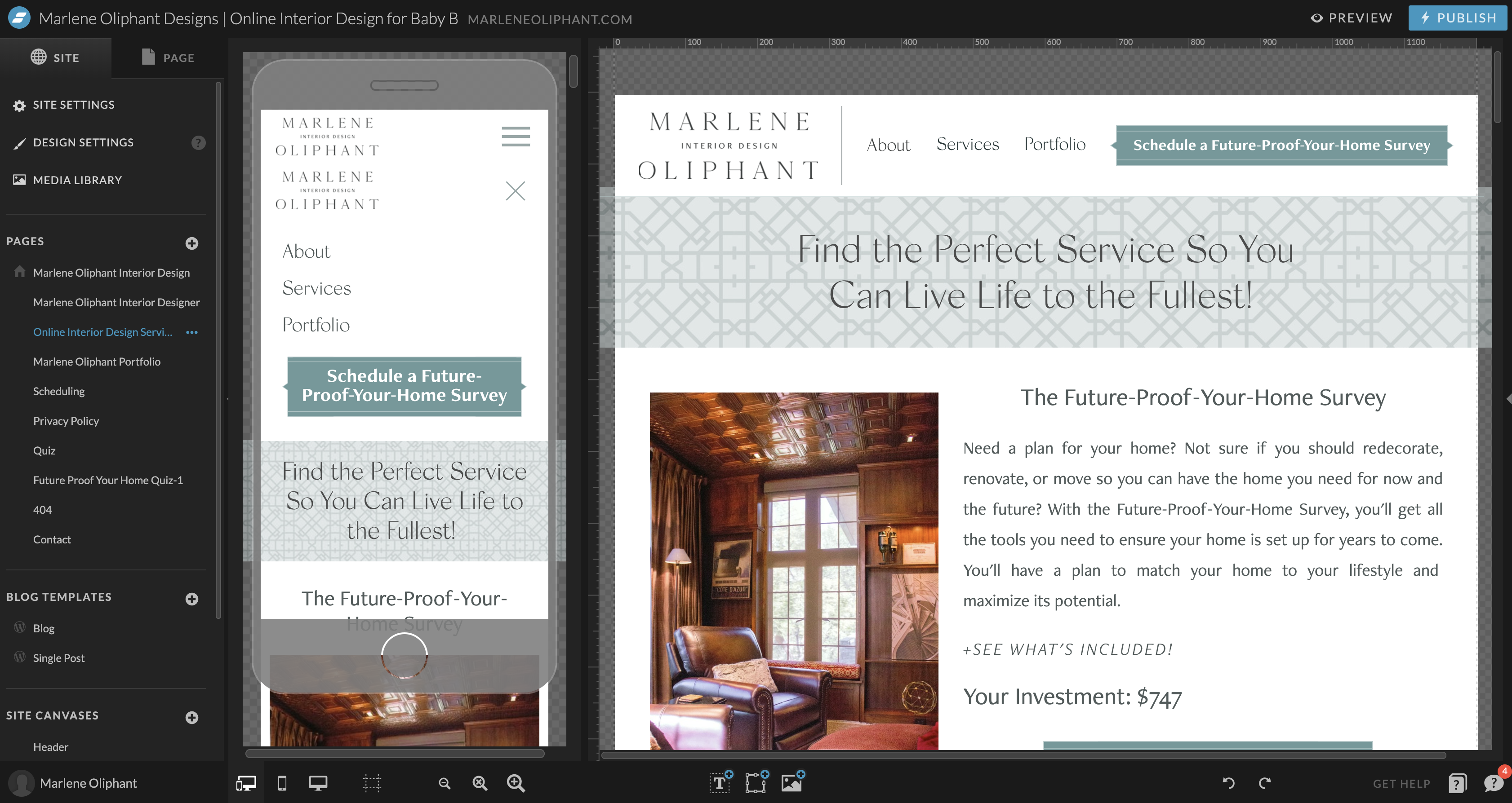
With a Showit website we are able to completely customize the look and functionality of our client’s Showit sites.
Yes, Squarespace is responsive, meaning it will scale to different device sizes, but we were never fully satisfied with the outcome. Websites always look off on at least one device, and they normally looked pretty bad on mobile.
And yes, WordPress can be customized for mobile as well, with tons of coding, which would take much longer than doing the design work in Showit, which would in turn, cost our clients a heck of a whole lot more money and time.
This reason alone is good enough to get you to move to Showit!
Related Post: 10 SEO Tips for Beginners That Have Nothing to Do With the Length of Your Copy
2. Showit’s Blog is Powered by WordPress
When we originally moved to Squarespace the one thing I missed was the blogging capabilities I left behind on WordPress.
I missed having so much control over my SEO with the Yoast plugin.
And while I was able to add in a sidebar to my Squarespace site even when the template didn’t have one, that involved complicated code. And while I can do complicated code, I’d rather not.
With Showit, we can design a completely custom blog page. We can make it look however our clients want.
And the actual blog post writing is done in WordPress and it magically populates into your custom blog design.
No complicated plugins to get the sidebar and social share buttons looking exactly as you like, like with WordPress alone.
No complicated coding to change the plain blog in SquareSpace.
3. Showit’s Design Capabilities Are Endless
You can do anything you can imagine in Showit.
And if you’re familiar with any of the Adobe products, you’ll find building your site a breeze.
It’s like building a website in Photoshop!
Want an image moved up ten pixels? No problem!
Want some text over a shape? Just drag it!
Want a call to action button that’s a bit more stylized (like ours?) Coming right up!
Custom fonts? No coding required!
Now yes, this can all be done with WordPress custom themes and with a lot of complex coding in Squarespace (and even then it’s limited and clunky), but once again, that will take up way too much time for us to do, which would cost our clients a heck of a lot more money.
A word of caution- endless possibilities can become Hot-Messville really fast if you don’t know how to design a website that converts. Resist the urge to make your website look like a 7th grade collage project.
4. Our Clients Can Easily Update Their Own Showit Website (Without Us)
Yes, we love helping our clients as much as possible.
And yes, we get to bill them, for it.
But at some point we want our clients to be a bit more self-sufficient with editing their website.
And while we’re probably leaving money on the table, it’s much better for our clients to be able to add in new testimonials on their own or update their portfolio page.
Yeah, I know, we’re suckers. We just love our clients too much to bleed them dry.
So with a quick tutorial here and there, our clients are setup to make some updates themselves which could be very complicated or confusing for them to do on a custom WordPress site.
5. Showit’s Media Library is Easy to Organize

This may seem like not that big of a deal, but Squarespace doesn’t have a media library.
And when you’re working with creatives who have portfolios full of projects with multiple images, not having a media library sucks.
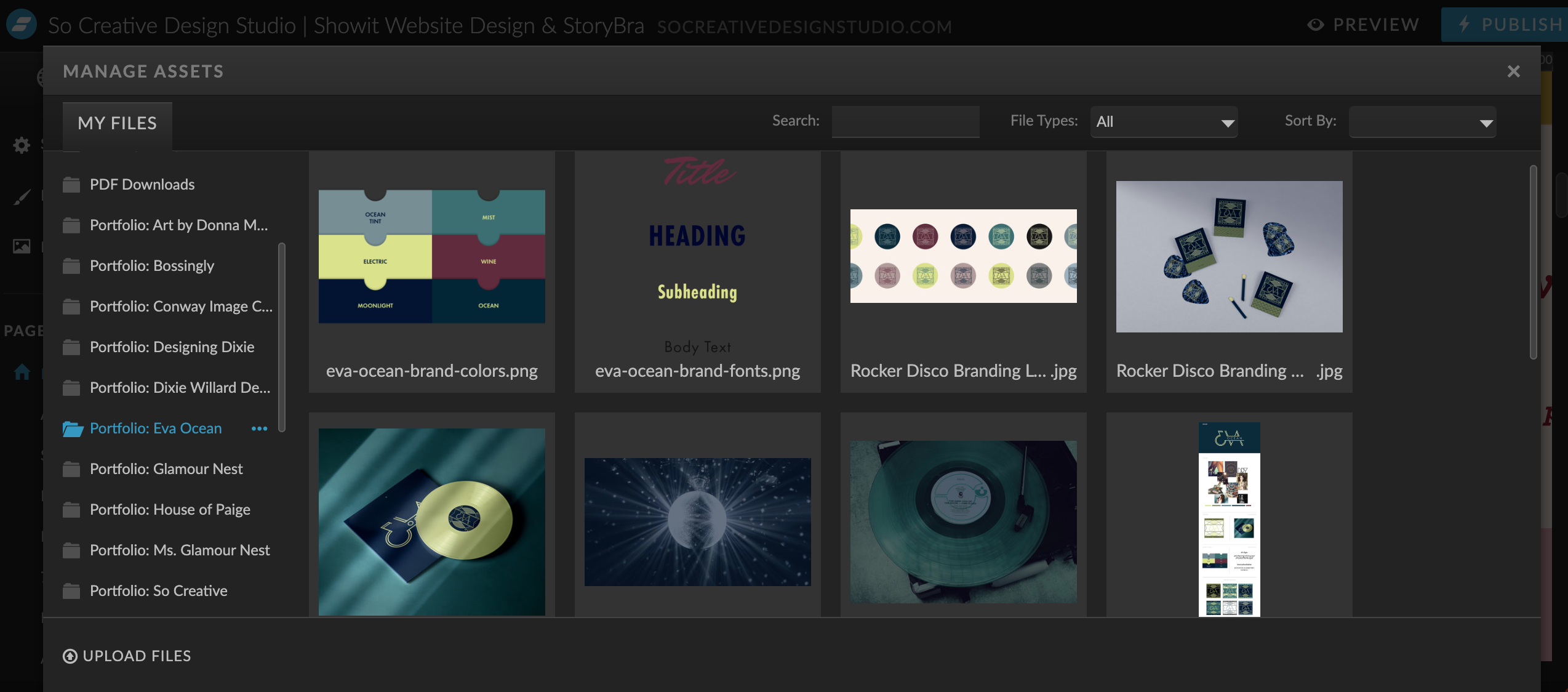
Showit’s media library is a dream! I’m able to setup different folders for different projects, styled photos, bio photos, logos, patterns, and keep track of everything so easily.
It saves so much time when putting together a site when everything is loaded in an orderly way and cuts down on build time because we know exactly where everything is located!
So are you thinking about moving to a Showit website?
You might want to make to move to Showit if…
- You want a completely customized website design but hate coding.
- You see all these beautiful websites out there and think, “How the heck did they do that?”
- You love your WordPress blog but you hate all the WordPress maintenance.
- You know you need to improve the look of your mobile site.
- You’re ready for a brand upgrade from Squarespace- it did its job. Now you’re ready to play ball!
- You don’t have an extensive ecommerce site. You can embed products using Shopify Lite, but there is currently no built-in ecommerce capabilities like Squarespace or with a WordPress plugin like Woocommerce.
Will you be making the switch? Still have questions about Showit websites? Drop them in the comments and we’ll answer them for you!


