5 Signs It’s Time to Rebrand Your Small Business

Deciding to rebrand your small business is scary. And it’s no small task. But sometimes it’s absolutely necessary to move your business forward.
Even though it hurt my heart for like a day, at the beginning of 2019 I decided to let go of my old brand, Ms. Paper Moon. It was my baby. But I knew it needed to be done to grow the business into what I wanted it become because the services I provided and the way I operated had changed so much from when I began.
You might be thinking about rebranding your own small business. Perhaps you’re looking to raise your rates and want to appeal to higher price points. Or maybe you’re just sick of everything because it feels outdated and tired!
Here are five signs it might be time to rebrand yourself, and five signs that you just might need a refresh instead.
1. Your business might need a rebrand if you have a new partner or you’re hiring employees.
When a new partner comes into a business, they can feel a bit left out in the voice of the brand if all the major decisions were made without them.
That’s the story behind our rebrand.
Ms. Paper Moon, my original branding business, was all me because I was the one doing a majority of the work, talking with clients, etc.
My image was everywhere, the name was my name, the services and processes were what I wanted them to be (more on services in a sec).
But then my husband and I decided to really make this a team effort. He did some behind the scenes work with our clients, and I wanted him to feel like he was a part of all the decisions.
So our new brand, including the messaging, aesthetic, and services is a 100% collaboration between the two of us.
If I bought something to wear for photo shoots, I ran it by him first.
While working on our new logo, he shared every step with me.
We could have gone on with the original Ms. Paper Moon brand.
But since this is our brand, we were both more excited.
I never wanted my husband, and now new business partner, to ever feel like he wasn’t included in any decisions…even though his appearances are going to be few and far between.
The same goes if you either no longer want to be the main face of the business and want to move beyond being a personal brand.
There’s nothing wrong with being a personal brand. People like Rachel Hollis, Marie Forleo, and Oprah have successful personal brands. But this business model isn’t for everyone. Not everyone wants to be “on” all the time.
So whether you’re looking to hire on employees to have more of an agency model or you’re just drained from having to be the face for everything, it’s time for a rebrand.
2. Your offerings have changed.
This might not call for a complete rebrand, depending on how drastically different your new offerings are from your old ones.
If you’re a wedding photographer and you add on an online course about becoming a wedding photographer, those are still within the realm of wedding photography.
But if you’re a wedding photographer and your branding is very florally and bridal and you decide that you want to also add in interior photography, the original aesthetic might not make it clear that you’re more than a wedding photographer.
I originally thought that I was just going to offer brand design.
And some branding that was super spacey, like the original Ms. Paper Moon look, worked because I was helping your branding go where no branding had gone before.
Little did I know that we were eventually going to be a full-service creative marketing studio, providing copy, and sales funnels, and photography, and SEO, custom illustrations, and more.
Pictures of me on the moon weren’t going to convey all these new services that we were offering.
Think about what offerings you currently offer and what offerings people are asking you for? If what people are asking you to do is not present on your website, it’s time for at least a refresh.
Why did we change our name?
Ms. Paper Moon was actually an accidental name.
When I ran Paper Moon Interiors, that name was being squatted upon on Instagram, and my full name was already taken, so I became Ms. Paper Moon.
And that seemed like the logical name for a branding business because I was being asked by other interior designers for branding help and they knew me as Ms. Paper Moon.
But here’s the problem with that name now.
It didn’t involve my husband. And I wanted it to.
It is so incredibly vague. You couldn’t tell what I did from the name.
And we knew we wanted to include “Creative Design Studio” into our new name for clarity and SEO purposes.
And my initials just happen to be S.O.
We could have used my husband’s initials, but then we’d be No Creative Design Studio.
We both agreed mine were better.
3. Your target audience has changed.
Once again, not a deal breaker, but if your target audience changes drastically then perhaps it’s time for a major overhaul.
Let’s take the wedding photographer again with the florally, blushy branding.
Now let’s say that photographer now wants to stop doing traditional weddings and wants to appeal to more edgy weddings, like something out of Rock ‘n Roll Bride magazine.
Or if you’re an interior designer and you originally thought you wanted to appeal to families on a budget but then you realized that you really like working with massive budgets.
In both of these cases, you’ll need a major overhaul, including not only your visuals and photography, but also your messaging and copy.
If you look at our recent rebrand, we slightly changed our target audience.
Before we wanted to work with creatives.
But then we realized that we liked working with small business owners and entrepreneurs of all kinds.
And our branding was too creative to appeal to that larger audience, but we still wanted it to be fun and different.
4. Your business might need a rebrand if your branding and website look dated.
Websites don’t have a long shelf life.
Technology is constantly changing.
So within a few years you may see that what was once trendy or stylish is now cliché or outdated.
If you are an established business that has had the same website, logo, and photographs for quite some time and you’re looking to up-level, we recommend a rebrand if the original design was designed around trends.
You don’t need to go as crazy as we did.
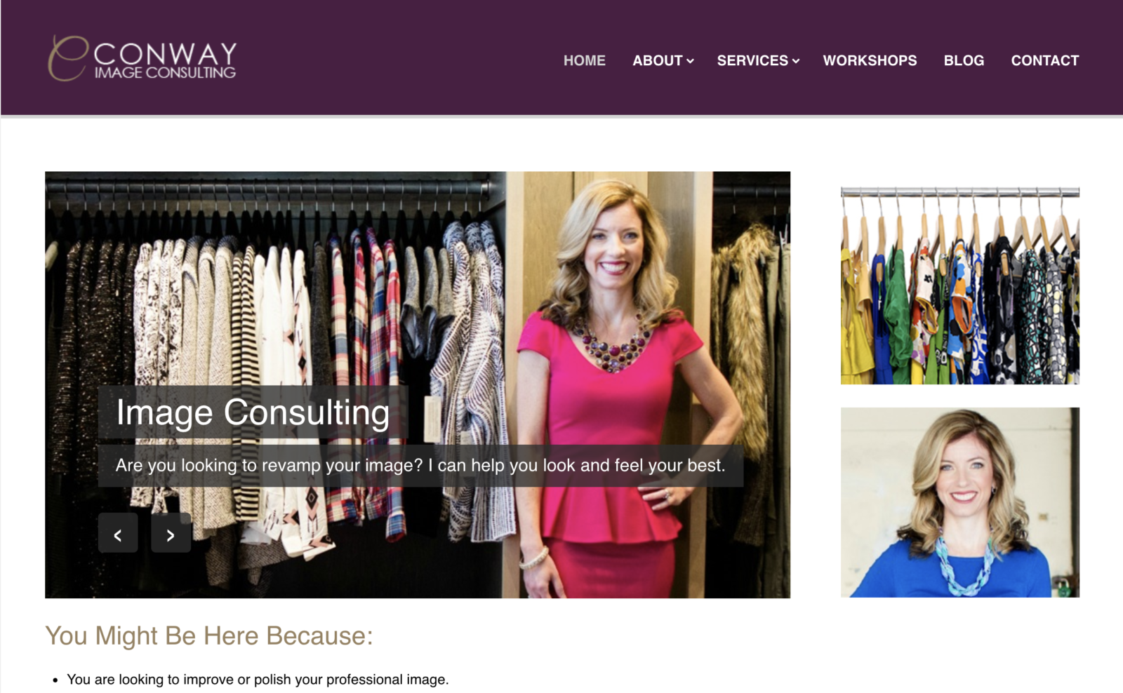
You can do what our client, LeAnn Conway of Conway Image Consulting did.

LeAnn had a solid business with plenty of clients before working with us.
She wasn’t building her team, she wasn’t changing her services, and her audience was staying the same.
But she admitted that her website wasn’t getting her clients and she wanted to change that.
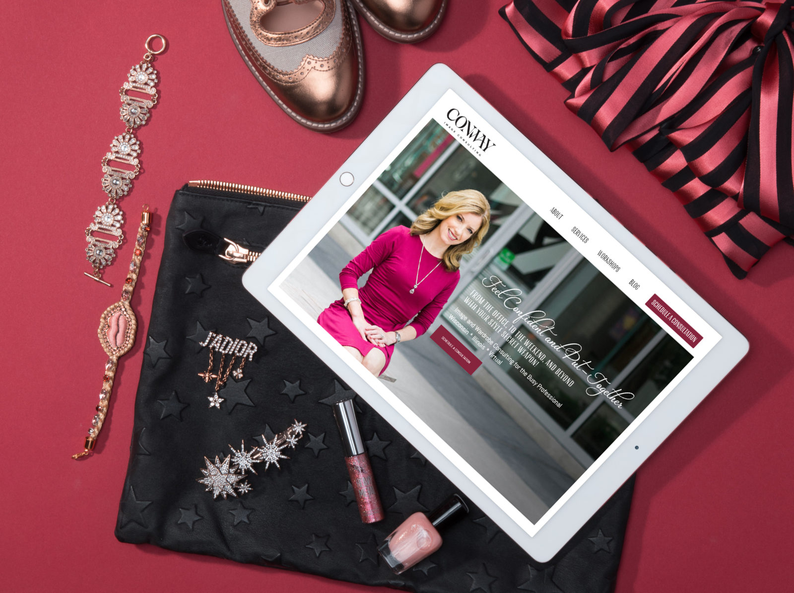
We worked together to design her a new website layout with a fresh brand identity, consulted with her regarding photography, and wrote clear copy.

Since launching, LeAnn has said her new website has been “game-changing” and now has plans to scale her service-based business with digital products and courses, something that wouldn’t have been possible without a website that was proven to convert.
5. Your business might need a rebrand if you’re ready for a premium brand experience.
If you started your business scrappy and didn’t spend much money on branding and a website- good for you! You made a wise decision.
Because when you’re just starting out, you’re figuring out what kind of business you want to run.
What kinds of clients you want to work with.
What services you’ll end up offering.
How you’ll position yourself in your industry.
And maybe your current brand is working well for the type of business you want.
But it might not.
Maybe you’ve realized that you like working with big budgets and would like to increase your rates.
There is nothing wrong with that. Once again- good for you! You’ll find no money-shaming here.
But that original brand and website you created on a budget might still look like you’re a Walmart when you want to be a Gucci.
Gucci budgets are attracted to Gucci brands.
Yes they love a deal, but they aren’t going to drop those big checks at Walmart.
This means it’s time for an overhaul. And the investment will be justified because you’ll have one more reason to justify your rate increase.
I want you to start thinking about your website like a physical storefront.
If you had a grungy studio with dirty furniture in a bad area of town, chances are, those big budgets wouldn’t think you were worth the money and would probably balk if they heard you charge $15,000+ for wedding photography.
But if you had a chic studio in the swanky part of town and served them chilled champagne and strawberries when they walked in the door, they’d think their money was going to someone they trust.
Premium budgets are attracted to premium storefronts.
Treat your website like a storefront!
Not all businesses will need a major rebrand, but all businesses should be freshened up every now and then to show people you’re still alive and still relevant.
Here are five signs you might just need a refresh instead of a rebrand.
1. Your branding looks nice, but your messaging isn’t working.
If you’re like most established businesses you probably invested in professional branding before you invested in professional copywriting.
Your copy is actually far more important than your logo and patterns.
People are captivated by branding but words are what sell.
It’s okay, but we can do better now!
2. You haven’t had new brand photos in a couple of years.
Or maybe since the late 90s.
Can you imagine if Justin Timberlake kept his same images from his NSYNC days!
I recommend getting new photos at least every year.
Your images need to look like you, even if you liked the way you looked more five years ago.
Just think what will go through future client’s minds if they meet you and the first thing they think of is how different you look from your photography.
Not a great first impression or a way to gain trust.
Get some new photos!
3. You haven’t updated your website with recent projects and services.
Guilty!
I understand what it’s like to be so busy that I actually never posted a portfolio on the Ms. Paper Moon website.
I was getting business and new clients, but it was kind of embarrassing. I’d have to send links to client work in a Dropbox folder.
When you don’t add new portfolio pieces, people that are thinking about hiring you might think you don’t have any clients or haven’t had any in awhile.
And then they’ll start wondering why.
Put a date in your calendar for this month and update that site!
4. Your logo is looking a tad dated.
Did you use Hello Beautiful (the font I want to die forever) or a similar font to create your logo about five years ago because that’s what everyone else did?
Well, you’re in the majority.
And now it looks very dated. (I’m going to be honest- Hello Beautiful never looked good).
Or perhaps you were part of the chevron craze of the 2010 era.
Or the pineapple-logo movement when your business has nothing to do with pineapples or the tropics (and the hospitality angle is now cliché).
This is what happens when you create a brand identity around a trend.
If this trend is new and not based on a design movement that has stood the test of time, it’s bound to get dated pretty quickly.
It might be time for a new logo and perhaps a couple of new fonts.
And please don’t choose Hello Beautiful.
5. You don’t have a call-to-action color.
Super easy fix!
Websites designed by So Creative are notorious for one thing- we love call-to-action buttons!
It’s been scientifically proven that the human brain needs to hear/see what you want it to do at least eight times before it realizes, “Hey, you want me to do the thing!”
That’s where your call-to-action button comes into play.
And the best call-to-action button is going to be one of two things:
- Brighter than the rest of your colors
- In contrast to the rest of your colors
And you should be consistent with the same color.
So if you don’t have a call-to-action color, then that’s an easy branding update that you can make today!
Conclusion:
Look over your current branding and marketing:
- What needs some light refreshing and what needs some major attention?
- If you’re changing directions in your life or business, it might me time to rebrand your small business.
- Or things might be solid and you just need to make a few small changes and updates.
Let us know what changes you plan on making to your brand and marketing in the comments!


