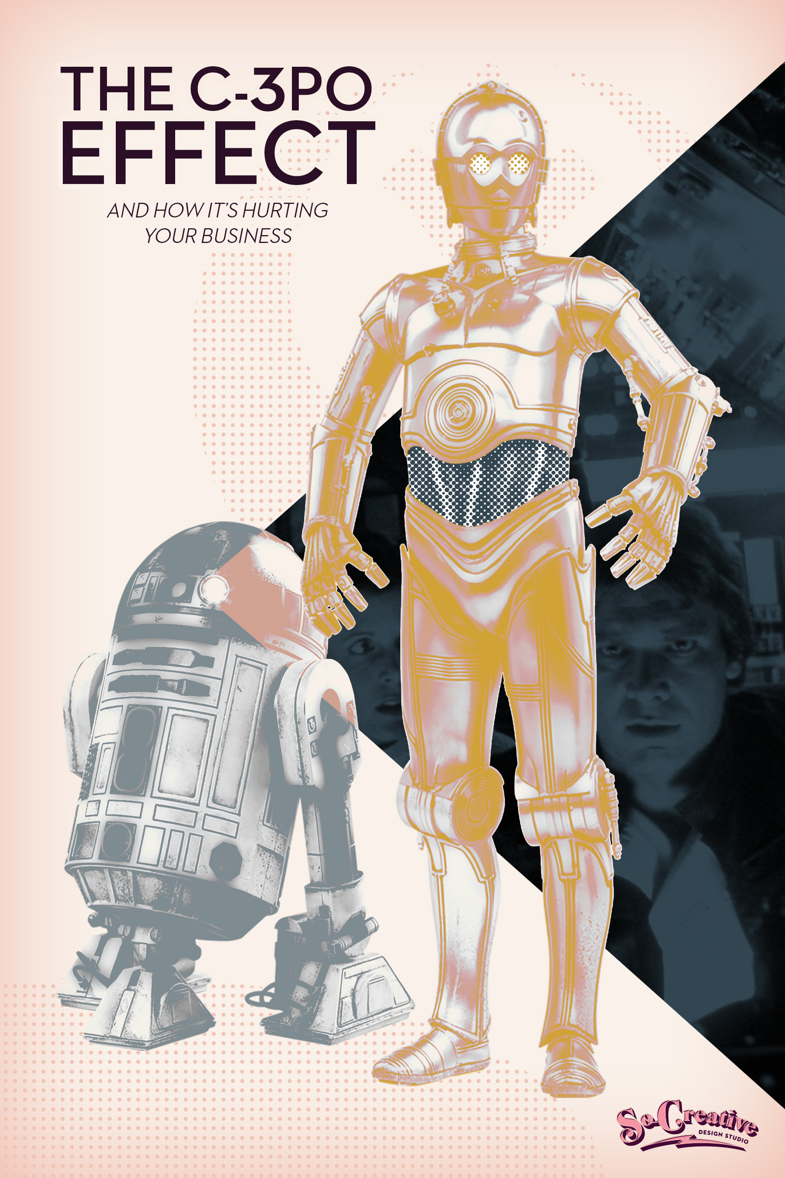
Does your website sound like C3PO? ‘Cause nobody ever listened to him!

Every great guide has a plan that will help their hero win the day. And the plan is the fourth part of the StoryBrand framework. The plan is also the reason why C3PO was never the guide in Star Wars.
Let’s be real- nobody ever listened to C3PO. Most of the time he rambled on about how horrible the situation was and how they were all doomed.
Instead of guiding Han away from the Imperial fleet with a solid plan, C3PO rambled, “Sir, the possibility of successfully navigating an asteroid field is approximately three thousand seven hundred and twenty to one!”


Obi-Wan Kenobi didn’t have to say much to get Luke to continue his training.
- You will go to the Dagobah System.
- There you will learn from Yoda.
- You will become a Jedi.
C3PO may have been fluent in over six million forms of communication, but nobody ever listened to him.
And that’s because he always gave out way too much information.
And when it comes to the plan on your website, less is better.
But as creatives, we tend to want to let everyone know every little tiny step in our process because we’ve thought it out so well.
But that is your creative process. How you do your thing.
The plan you put on your website is your plan for client success.
There is a time and a place to let people know every little step of your entire process- and that’s after the client has booked. When they’re on your calendar is the perfect time to get all C3PO and explain every bit of your process.
But until you’ve been hired, keep the plan simple and clear. Always remember that nobody ever listened to C3PO!
Here are three tips for getting an effective plan on your website.
Creating Your Plan Tip #1: Keep it to 3-4 steps

We always keep our steps at three when writing copy and designing our clients’ websites, but four should be your max.
Remember- people are coming to you with a problem to be solved and if you’re writing out your entire process like a 12-step program, you’re only adding to their frustrations. You’re making working with you sound like way too much work.
Creating Your Plan Tip #2: End with the transformation

Now the third step isn’t technically a step in your process, but it is a step in your customers’ journey. The step where they become a hero.
Word your final step in a way that shows website visitors how your plan will transform their life.
Creating Your Plan Tip #3: Add visuals

Because nobody likes to read a bunch of copy.
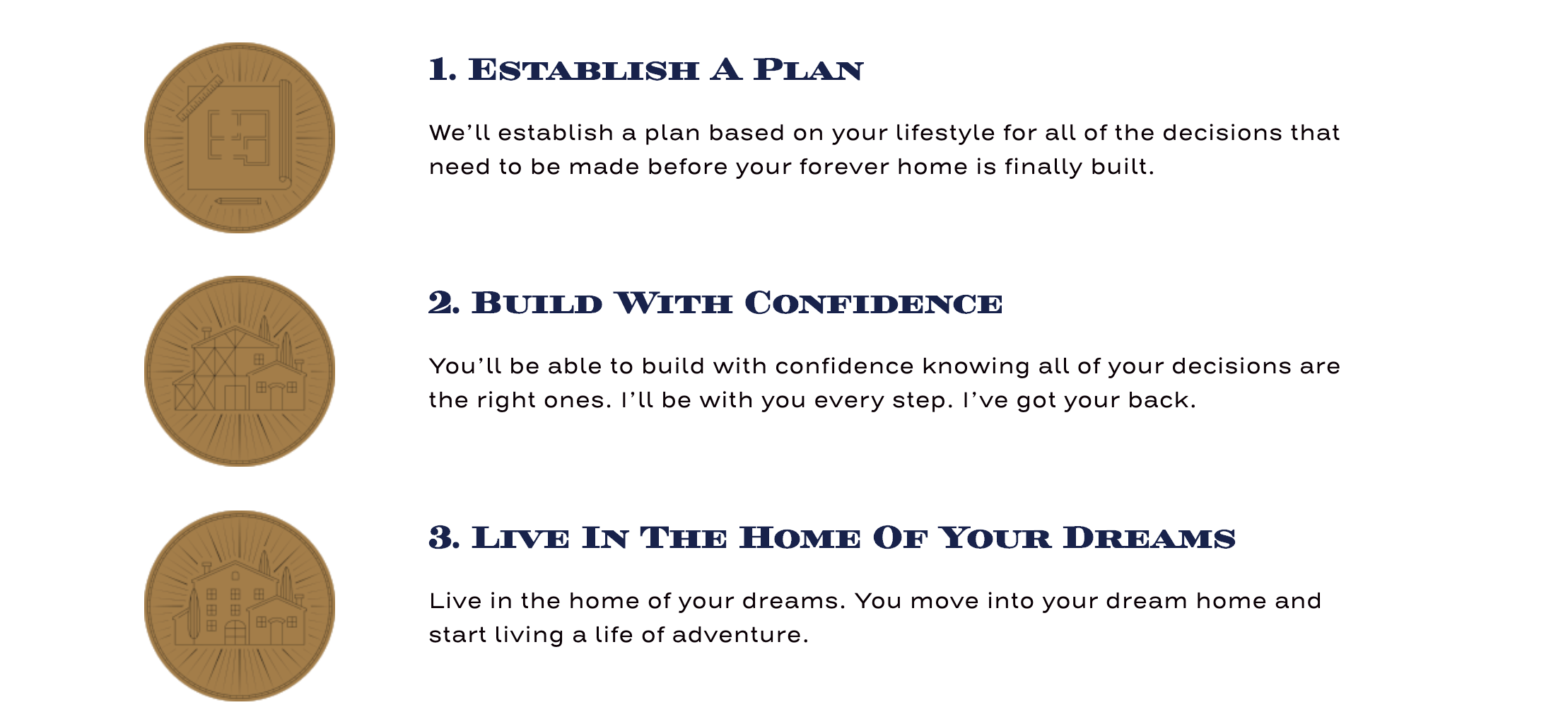
Break up your text with either an icon or a photograph that illustrates each step of the plan.
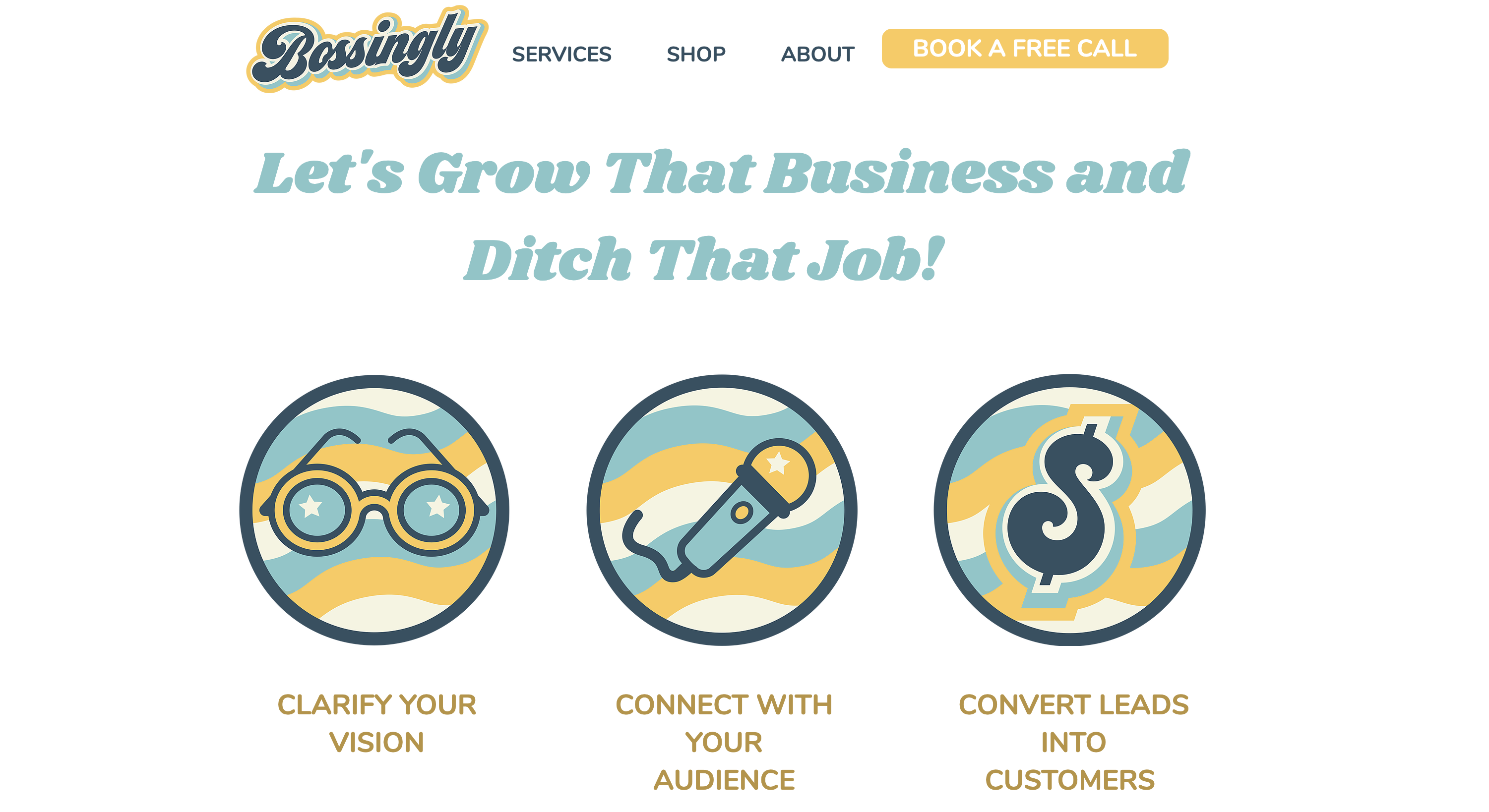
We create custom icons for our clients as part of their brand design service to illustrate their plan. The easier you can make your plan to understand, including formatting and visuals, the more likely people will pay attention and realize how easy it will be working with you.
Be the guide that everyone wants to work with! Add a plan to your website so visitors can see how easy solving their problem will be (and how you will help them become the hero) once they book your service!
Next Up:


