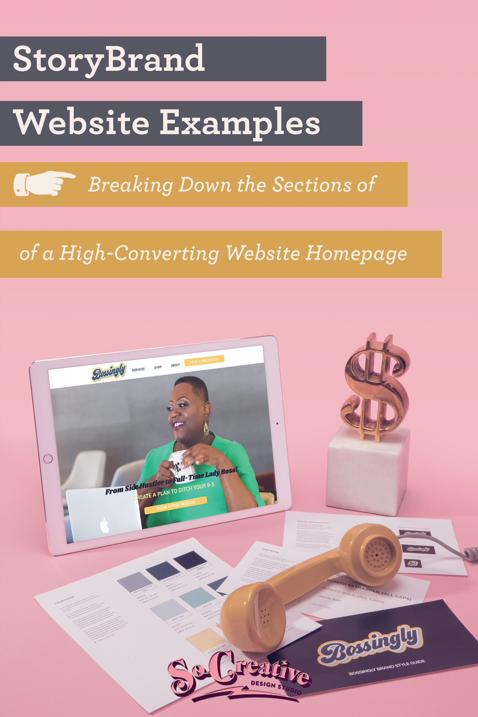
So you’ve got a StoryBrand Brandscript- sweet! Now what the heck are you going to do with it? You’re going to transform your website into a high-converting money machine that also meets the needs of your website visitors and makes their lives better. How are you going to build this website? With these StoryBrand website examples from our clients, of course.
What? You don’t have a StoryBrand Brandscript? You don’t know what StoryBrand is? Head on over to our StoryBrand resource page and start crafting a message that your customers will notice.
A Word of Caution: We are not StoryBrand disciples. Yes, I am a StoryBrand Certified Guide, but I also think there are areas of the framework, particularly when it comes to designing a website in a way that truly meets the needs of our clients’ user profiles and their particular businesses, that can be improved. So we bend the rules and sometimes we disagree with the framework. Storybrand isn’t Bible, it’s more like pirates’ code.
Let’s proceed.
The Navigation
No need to get carried away on the navigation bar. From the point of view of your site visitors, they’re looking for are clarity, limiting overwhelm, and a direct call to action.
The human eye will read the navigation from the upper left corner to the upper right corner, so we always recommend putting your direct call to action in the upper right corner and designate a specific color as your call-to-action color.


As for the number of links in the navigation, keep it to the essentials.
We recommend no more than six, but it will vary with each business.
If you’re starting your website from scratch and do not have analytics, include the bare basics. Any essential services, product offerings, etc. This will of course be much more complicated if you are a heavy ecommerce site, so more navigations and dropdowns make sense if this is you.
If you are reworking an existing site, look at your analytics and see which pages people visit the most.
If people visit your blog often, include it.
If website visitors never click on your about page, and your about page is on your navigation, move that link to the junk drawer. We’ll get there in a sec.
Question: Should the navigation scroll with the page?
Answer: We like to do this if we’re designing a site that doesn’t repeat the direct call to action several times throughout the page. Yes, StoryBrand recommends adding the direct call to action eight times on a homepage, but depending on your brand, this could be overkill or seen as too salesy by your customers. To eliminate having the overdone CTA, we like to scroll that nav so the direct call to action is always in place.
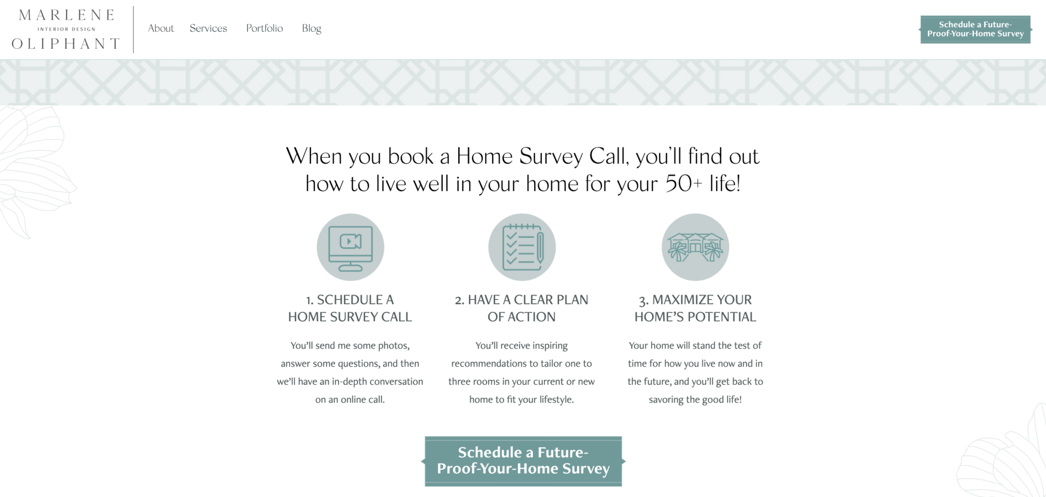
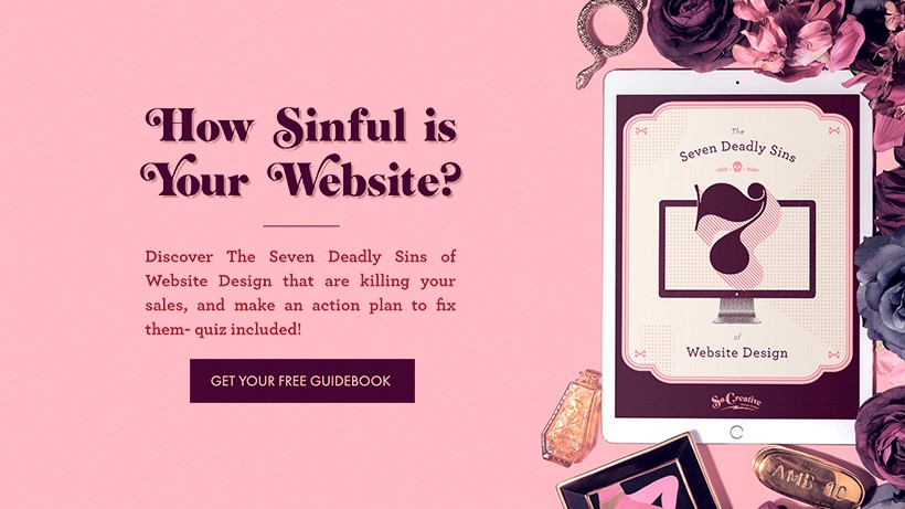
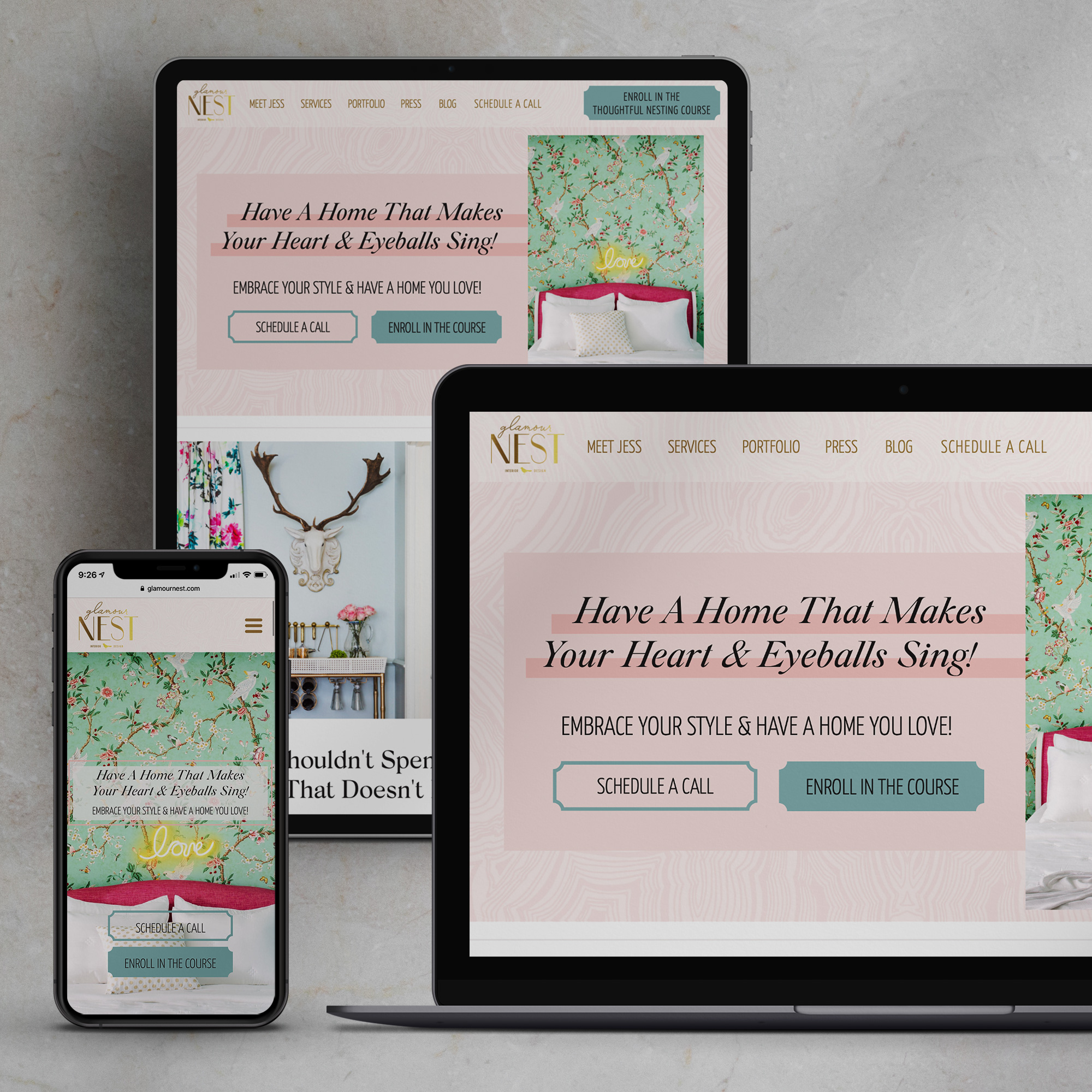
The Hero Banner (Don’t Let the Name Confuse You- Every StoryBrand Website Example has a Hero Banner)
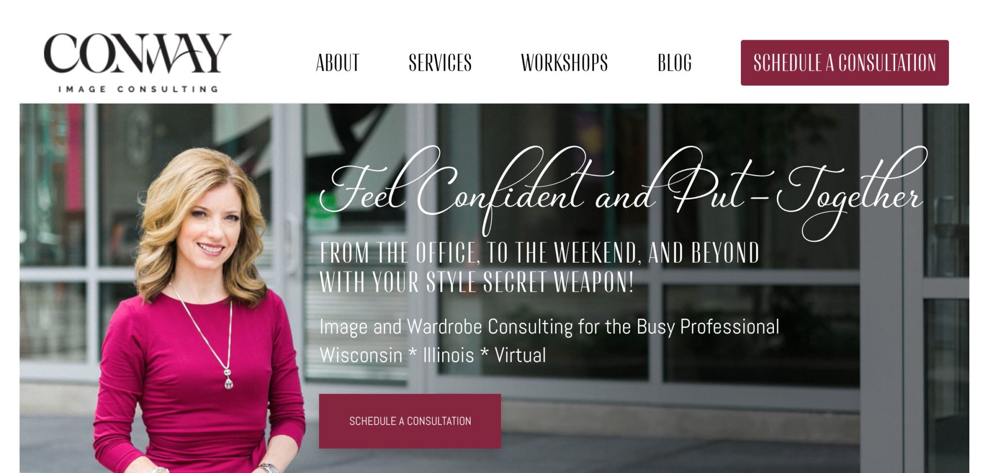
Yes, any StoryBrand website example will have a hero banner, even though we’re not playing the hero. It’s just what the website design world calls the banner directly underneath the navigation, so we’re rolling with it.
The job of the hero banner is threefold. When someone lands on your site, they should immediately be able to answer:
- What do you do? (Exactly what you provide)
- Why do they need it? (The problem you solve)
- How do they get started? (The direct call to action)
Some studies show that you’ve got eight seconds to get this into your customer’s brains, and others say four.
Regardless, you’ve got to clearly and quickly make sure your website visitors know the answer to these three questions, or they’ll get confused and bounce.
We also like to include a location if you’re local only- it’s super frustrating to not know right away if your business serves an area or not.
Extra Credit: Depending on what you provide, use an image that shows customer success in the hero banner so people can imagine what life will be like after they purchase from you.
Question: What about SEO? Do StoryBrand website examples take this into consideration?
Answer: Great question! Do you know what phrase you want to rank for? Get it into the copy in this section, but always remember user experience over SEO. You’re selling to humans, not the Google crawler, right?
And if you don’t know what keyword phrase you’re trying to rank for, why are you worried about SEO? Get your damn site updated and stop making excuses!
Question: Can I use an image of myself in the hero banner? Or are all StoryBrand website examples against this?
Answer: Yes, as long as you position yourself as the guide. We only recommend this if you’re the face of the brand and if people are buying into either working with you or working through your method or course.
Question: What about revolving hero banners- are those StoryBrand approved?
Answer: No. We know it sounds like a great idea to continually change the hero banner every few seconds to show off all you offer, but the thing is, people need to know quickly your overall message and how to get started. If you keep changing your messaging every few seconds, you’re adding noise and confusing your website visitors.
The Value Stack
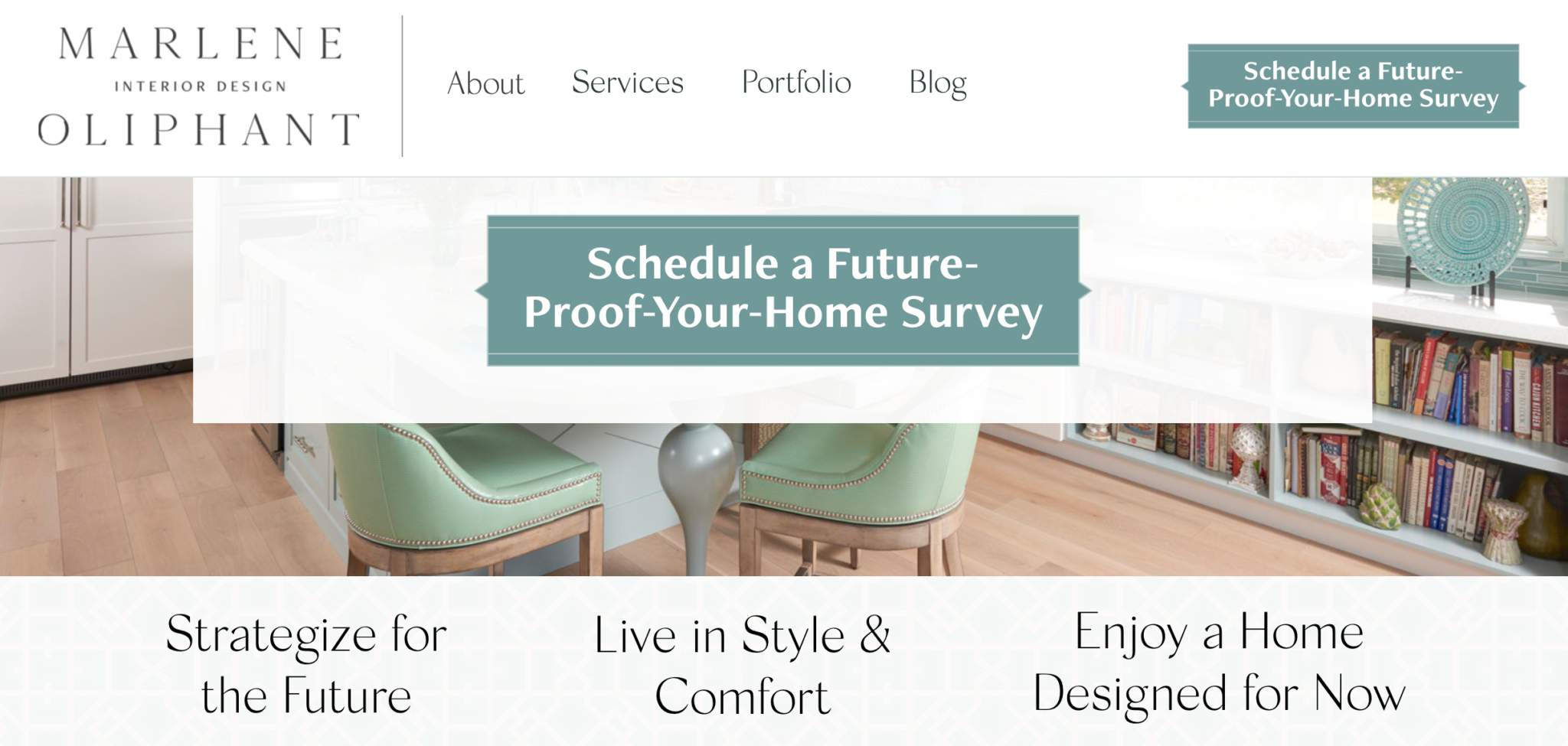
A tiny little section can go a long way.
Directly after your hero banner you’ll want to add a three-part value stack.
Think of it as explaining three major points of value your business provides.
You’ll pull this from the success bucket of your StoryBrand script.
Question: Do we include tangible items or intrinsic value?
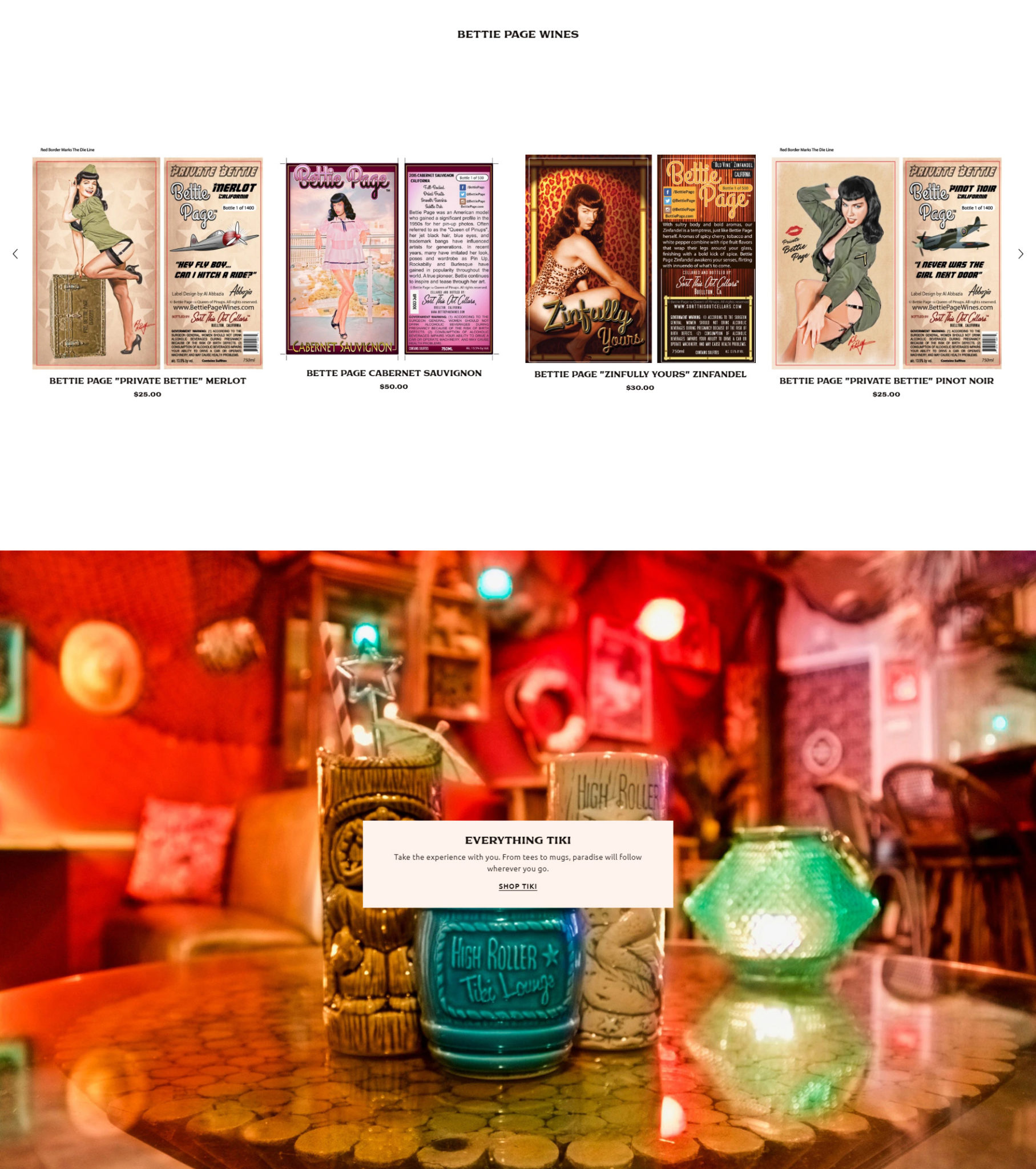
Answer: StoryBrand will say intrinsic value, and that’s what we do for the majority of our clients. What the success of using your product or service will lead to. But we’ve found that, especially for eCommerce websites with a variety of digital and physical products, it can be helpful to give a quick snapshot of some of the products you offer.
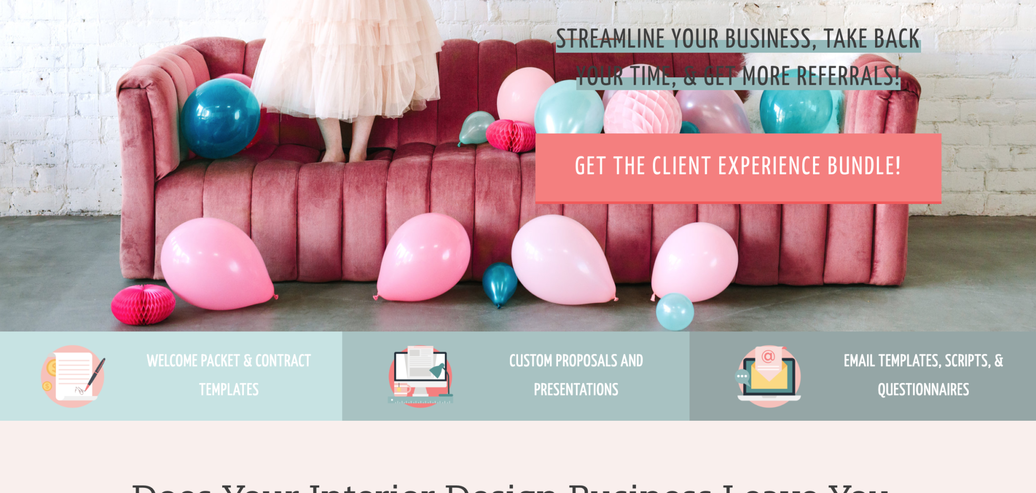
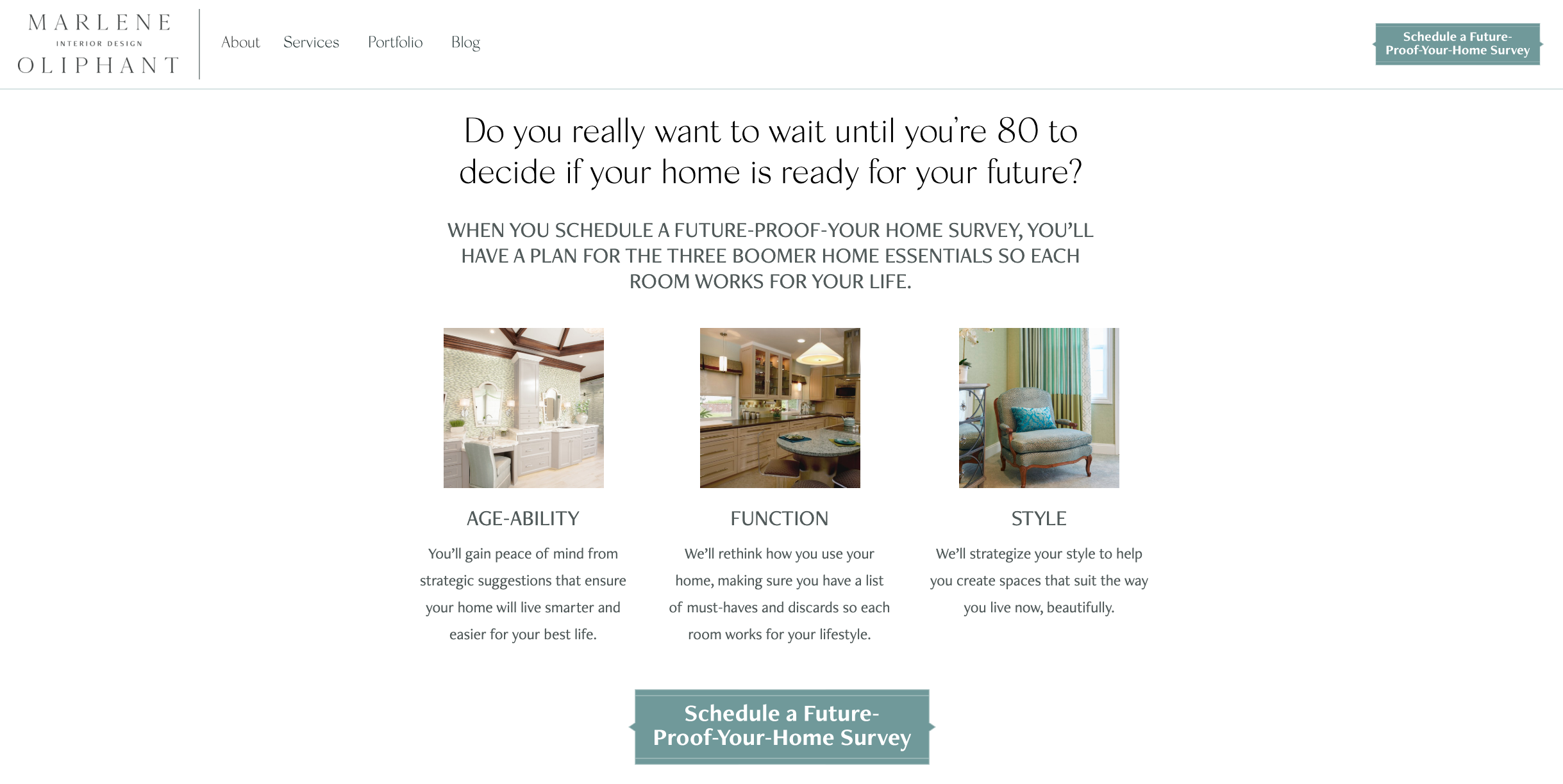
The Value Proposition

How are you going to help people overcome their obstacles and win the day with your products and services?
You can’t just rely on a great image (even though this section will need one).
In this section you’ll lay out the underlying problem, agitate it a bit, and then show an image of success with both a literal image and words.
While we don’t like to write this section strictly to a formula, we do include the internal problem (possibly some bits form the failure section of the BrandScript, depending on the industry), language from the success section of your BrandScript, and a language pulled from the aspirational identity or philosophical problem of the StoryBrand Brandscript.
Sometimes we put a call to action- once again, it all depends upon the industry. Some just lend themselves for a bit more selling, while others need a chillaxed selling approach (StoryBrand will tell you to add one always, but we use both our gut feeling and research on your demographic).
Question: I don’t want to be negative at all. How do I go about this section? Any StoryBrand website examples that don’t go negative at all?
Answer: Is telling people the problem you solve negative? We don’t think so. Even if you just pull in a philosophical statement from the “problem” section of your Brandscript, you’re directly pointing out how you’ll make people’s lives better. We get this pushback from clients quite often, but in the end if you don’t tell people what problem you solve, you aren’t showcasing the true value of your business, even if done in the most subtle of ways.
The Explainer Paragraph
Now you might be wondering, “Where the heck is all my copy on this page? My SEO is going to take a hit because I’m not writing much.”
First, there is so much more to SEO than copy, which you can read all about in this blog post.
Second, people don’t read. You’ve probably skimmed this blog post yourself- go on- admit it!
You’ve got to remember that you’re selling to humans and humans will read right through all that keyword stuffing.
But if you are concerned about getting more copy on the page, then this section is for you…possibly.
A true StoryBrand website example will have this section, and it includes the StoryBrand One Liner (craft your own with this resource) and a paragraph that compiles your entire BrandScript into one paragraph.
Here’s where you get some copy in.
Now you need to decide whether that paragraph will be hidden in a dropdown (much better for user-experience since we’ve already established that PEOPLE DON’T READ), or if you’re willing to take the user-experience hit in the sake of SEO and put the whole dang paragraph on the homepage.
We hide it. We always choose user experience over SEO. Because no matter how many people come to your website, if the experience is bad and full of copy that’s just there for SEO, the experience is lacking.
Question: Is this section mandatory?
Answer: Depends on who you ask. If you ask StoryBrand, yes. If you ask us, no. We only include it if it makes sense for the business. Sometimes we move this section to the about page.
Question: Does the order of these sections matter? Or can various StoryBrand website examples play around with the flow?
Answer: Yes- to an extent. You’ll always want the navigation, hero banner, value stack, and value proposition to be your first four sections in a true StoryBrand website. After that, play around with the flow and feel out what works best for the user experience.
The Plan: You’ll See These in All StoryBrand Website Examples
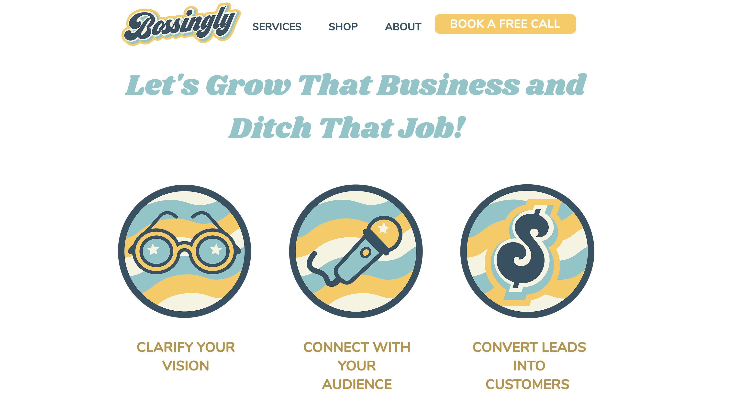
Every StoryBrand website example will have a plan. It’s the easiest way to spot a StoryBranded website.
There are two types of plans: the process plan and the agreement plan.
Sometimes the process plan is so obvious and overly simplistic that an agreement plan might work better. Think of it as a way to include your brand’s core values.
But sometimes the service being offered feels so overwhelming that you’ll want to use the process plan to outline how incredibly simple working with you will be.
Pro Tip: Use some non-stock icons designed specifically for your brand in the plan section. An easy way to set yourself apart from the StoryBrand formula will always be unique design with personality.
Question: Can I add both the process and agreement plan?
Answer: Yes, as long as it’s what is needed for the user experience. Sometimes the agreement plan is related more to your business, in which case it is best saved for the about page. Just think about what your website visitors will need in order to see the value of your brand.
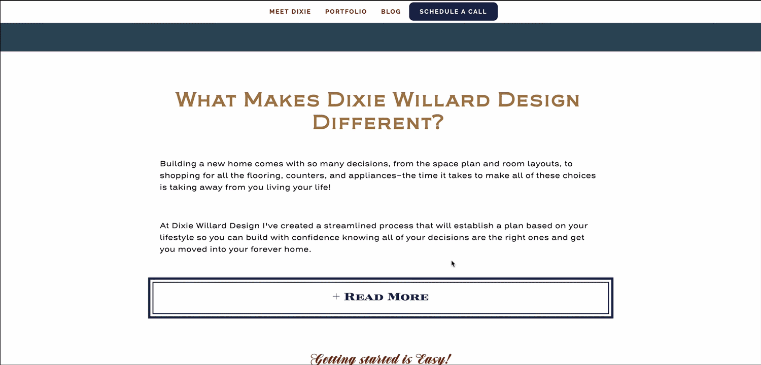
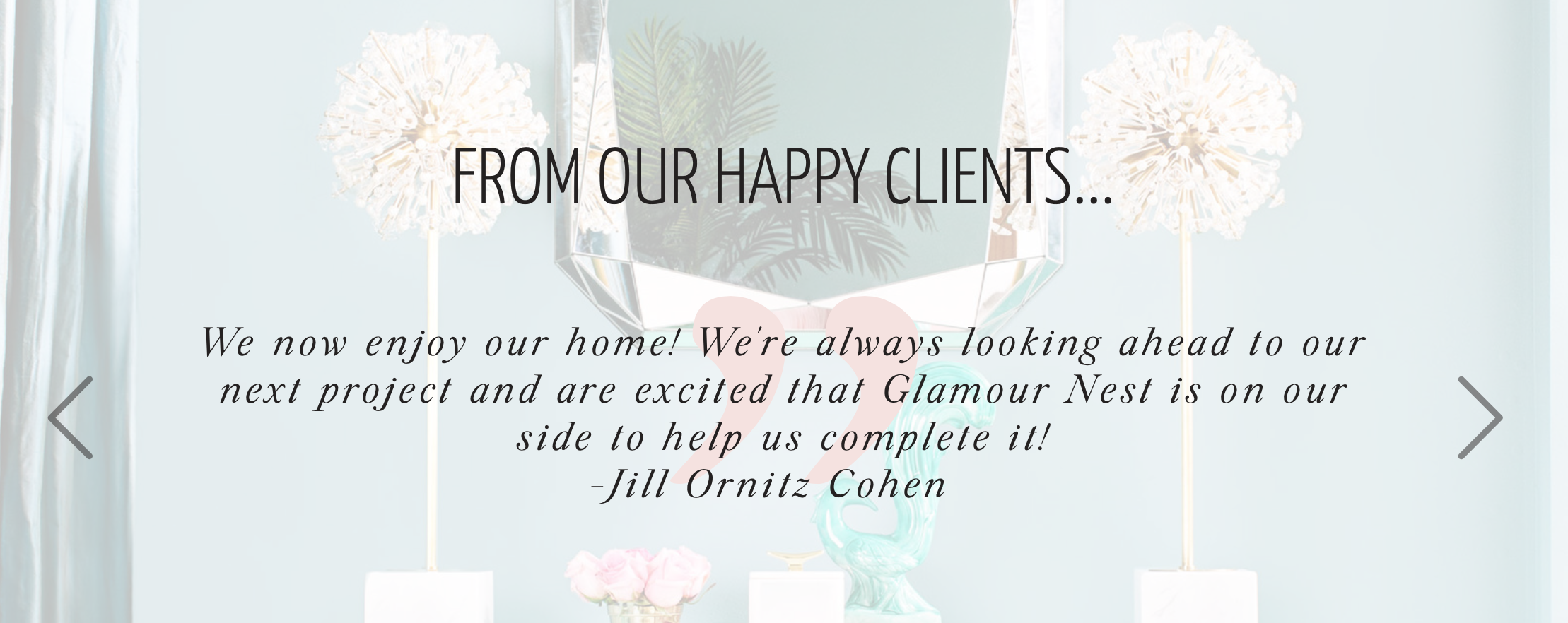
The Guide
There are a few ways you can go with the guide section. Will you choose empathy, authority, or a combination of both? (Read more about being the guide in this article).
If you want to connect with your customers immediately, include a section about your brand that outlines how you understand where they come from (this is ideal for personal brands and service based businesses).
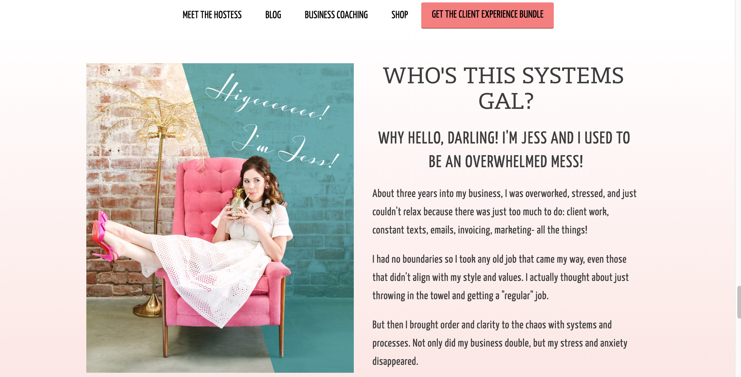
If you want to lean in on authority, show off a portfolio slider, testimonials, or a logo bar of either press mentions or brands you’ve worked with.
As always, what do your ideal customers need? Include that.
The Transitional Call to Action
So people have been through your entire homepage and they’re still not sure if they want to buy from you.
Grab that email address!
If people have the slightest interest in making a purchase, but just not at this second, the best way to keep in touch with them is through email.
Offer something that is high value (obviously) and is a natural lead-in to purchasing from you.
Pro Tip: Use a pop-up in addition to this section. Yes people hate pop-ups, but wanna know the reason people still use them? They work. Play around with making them not-so obnoxious by having them come in after 15 seconds or on a ⅓ scroll of a page. But use them! We integrate our lead generator through our email service provider Flodesk, which includes a pop-up service. Check out our Flodesk affiliate link to get started with a 50% off discount.
The Junk Drawer
Just like the name implies, this is where you’ll put everything else.
Your social media icons, your Instagram feed, your privacy policy, customer service support, anything and everything else that you aren’t putting in the main navigation but want to include.
Question: Why can’t I put my social icons in the main navigation?
Answer: Why do you want to compete with your direct call to action? Why do you want to lead people directly off your website and into a rabbit hole of other people’s brands? Why do we keep getting asked this question?
Other Questions You May Have…
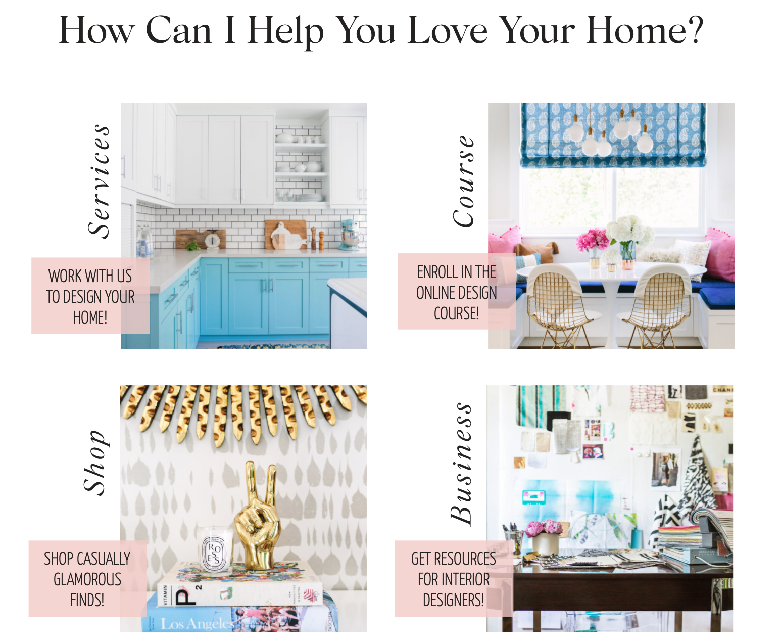
What About Different Revenue Streams? Any StoryBrand Website Examples of this?
Great question, and something StoryBrand doesn’t cover so well (sorry StoryBrand).
Most businesses have multiple income streams, yet your homepage needs to have one focus.
Now if you’re an ecommerce site, the StoryBrand Framework is really going to be more of a loose guideline rather than a strict framework. Your homepage is going to need to highlight your various product lines. A well mapped out navigation, sections with new collections, and a section of top sellers sprinkled throughout will help.
But if you have just a handful of different revenue streams, you’ll want to include a section in your homepage that serves as wayfinding. Sort of a choose-your-own-adventure section where people can find what they’re looking for easily.
What About Luxury Brands?
Yes- luxury brands are a different website type all of its own.
Think drama, think leaning heavily into your Brandscript’s aspirational identity and philosophical problem. Shower the website with images of success. Think exclusivity- which means you won’t be adding an abundance of direct calls to action buttons all over the place. It’s off-putting to your clientele.
You might also want to lean in to the authority part of your BrandScript. Does your brand have press features, endorsements? Will this matter to your website visitors?
What if I Have Two Direct Calls to Action?
Another great question and something we work with our clients on in-depthly.
Let’s say you provide a multitude of services. And all of your clients are onboarded in the same way.
Use a direct call to action to schedule a call, get a quote, or whatever the first step may be. Read this blog post on crafting the perfect call to action.
But if you have more of a done-for-you service and a do-it-yourself course, we see absolutely no problem in having two calls to action. Booking that call or enrolling in the course.
Remember- StoryBrand is a framework, and like all frameworks, learn it and learn how to break the rules accordingly. That’s why we believe no two StoryBrand website examples should be the same because no two businesses are the same.
Can I put recent blog posts on my homepage?
Yes- this is another perfectly acceptable section to include on your homepage if people come to you to read your blog. Check your website’s analytics to make sure, because if they aren’t it’s just adding to the noise.
Conclusion: What Should You Do With All of These StoryBrand Website Examples?
We want you to use these StoryBrand website examples just like we do. As a jumping off point.
No single formula can cover the multitude of website types out there, and every brand has different messaging and user-experience needs.
If you stick exactly to this formula, you’re compromising on creativity. Which isn’t necessarily a bad thing. Just remember, there’s a very fine line between being just creative enough and boring and cookie cutter, which your brand should never be.
If you know there’s something you must include, include it.
If you know something is too redundant, eliminate it.
Once again, these are more like guidelines. And a true brand designer will know when to work with the guidelines set out by these StoryBrand website examples and when to bend them a little (or a lot) to meet the website visitors’ needs.